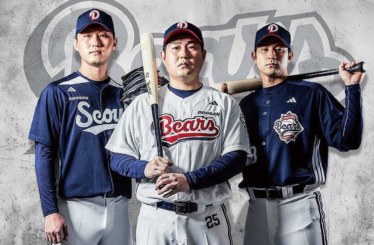
Doosan Bears
Few things can rival the feeling of stepping into Jamsil Stadium for the first time. Its beauty. Its history. Its architecture. Simply breathtaking. It’s the roar of the crowd unified in song. It’s the soaring of flags flying. It’s the celebration of fans cheering. Simply breathtaking. Seoul is a city of fandom. Proud. Passionate. Powerful.
When a team with a history as rich as the Doosan Bears approaches you, you know the stakes are high. Possessing a legacy of championships and a culture built on grit, hustle, and determination, they entrusted us to carry their story forward. A partnership in understanding and execution as we sought to breathe life and excitement into one of the founding members of the KBO.
This process took close, constant collaboration. From countless design drafts and calls, we left no stone unturned until the final mark captured the essence of their hustle and heart. We worked cross-culturally with their incredible brand team, we embraced challenges, listened deeply, and iterated tirelessly.
As we listened to the Doosan team share their vision for bringing the new brand identity to life, three key words stood out: Hustle, Miracle, and Perseverance.
These three words provided the foundation for our creative development—an identity system that would resonate deeply with players, the organization, and fans alike. Their storied legacy of championships, combined with the strong familial connections between past players, employees, and the team, is embedded in the heart of Seoul. Our goal was to tap into that rich emotional bond and extract the essence of what makes the Bears truly remarkable—elements worthy of celebration.
PRIMARY EMBLEM
At the core of this identity system is the Primary Emblem, which serves as the crown jewel of the visual brand. Drawing inspiration from the team’s past logos and blending them with a timeless baseball aesthetic, we crafted an emblem that not only stands out in the league, but also reflects the organization’s passion, legacy, and relentless pursuit of victory.
LOGOTYPE
With Hustle, Miracle, and Perseverance as guiding principles, we turned our attention to the Logotype. We wanted the typeface to embody the spirit of the “Hustle-Doo” mentality that defines the Bears. The addition of a classic script tail motif captures the energy and momentum that the team brings to every game.
SYMBOL
The Symbol is one of the most sacred elements in the brand history. Our team took great care in crafting a mark that both honors the foundational strength of the Primary Emblem and mirrors the dynamic flow of the Logotype.
CUSTOM TYPEFACE
Additionally, we were tasked with creating a custom typeface for the Doosan Bears: Hustle Block. Designed with a classic, utilitarian baseball feel, it draws from the tradition of past Doosan block lettering, while incorporating modern touches.


