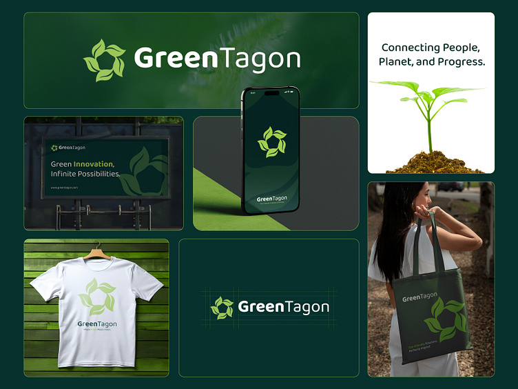
GreenTagon Logo Branding
GreenTagon: A Branding Design Geared Towards Sustainability
The rise of sustainable practices and green initiatives in today’s corporate world has fostered a growing demand for impactful, eco-friendly branding. GreenTagon, a brand committed to connecting people, the planet, and progress, has embraced this ethos in its recently unveiled logo and branding identity.
A Closer Look at the Design
The GreenTagon branding design speaks volumes about the company’s mission. The centerpiece, a vibrant and modern logo, combines visual simplicity with deeper symbolism. It features a unique design that cleverly incorporates the form of leaves and a pentagon in negative space. This dual imagery signifies the brand’s focus on harmony between nature and structure, symbolizing balance, sustainability, and growth.
The choice of green hues reinforces the eco-friendly focus, evoking feelings of freshness and vitality, while the clean, sans-serif typography ensures the brand feels modern and approachable.
Versatility Across Platforms
One of the standout features of this branding is its adaptability. The GreenTagon logo and visuals are seamlessly integrated across multiple mediums, including digital platforms, merchandise, and promotional materials:
Billboards and Posters: The striking logo paired with the tagline, “Green Innovation, Infinite Possibilities,” creates a powerful visual for large-scale advertising.
Digital Presence: The sleek app design and website mockup showcase the logo in digital environments, ensuring it remains sharp and recognizable on screens.
Merchandise: Branded products like tote bags and T-shirts make the logo wearable and widely shareable, amplifying the brand’s message.
Eco-conscious Messaging: Accompanying the visuals, GreenTagon’s slogan, “Geared Towards a Greener Future,” reinforces the brand’s dedication to sustainable progress.
Balancing Simplicity and Impact
The minimalistic approach to design ensures versatility and scalability, which is critical for modern branding. Whether displayed on a smartphone app or a large billboard, the GreenTagon logo maintains its clarity and visual appeal.
The integration of the pentagon in negative space adds a geometric dimension to the logo, suggesting stability and strength, while the surrounding leaves emphasize renewal and organic growth. This combination effectively balances simplicity with deeper meaning.
Connecting Purpose with Design
GreenTagon’s branding doesn’t merely showcase a visually appealing logo; it encapsulates a purpose-driven narrative. From the harmonious design elements to the eco-conscious messaging, the brand reflects its commitment to creating a sustainable future.
Through its branding, GreenTagon communicates not just who they are but also the values they stand for — a reminder that thoughtful design can be a powerful tool for driving meaningful change.


