Accessibility: How to communicate with color accessibly
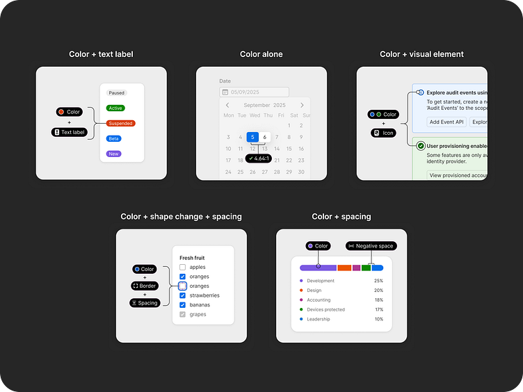
For 1Password’s design system, we have some documentation that outlines how we use color. I decided to also include some guidance on how to communicate with color that is more accessible. To help visually explain, I created some examples to show the guidance in the context of our product. I may turn this into a Dribbble series to explain each example better, but this is a start!
Overview
Per WCAG, color shouldn’t be the only way to convey information, indicate an action, prompt a response, or distinguish a visual element. This is because not everyone perceives color in the same way, which can make it difficult to differentiate one color from another.
This doesn’t mean that you shouldn’t use color for signaling meaning, but it should be complemented by other visual indications, which can include:
1. an accompanying text label
2. an additional shape change to establish a visual differentiation, e.g. thickening a border, underlining text, bolding text, etc.
3. color (surprise!), as long as the difference between the colors used for visually distinguishing has a contrast ratio of 3:1 or greater.
4. another visual element like an icon or negative space
