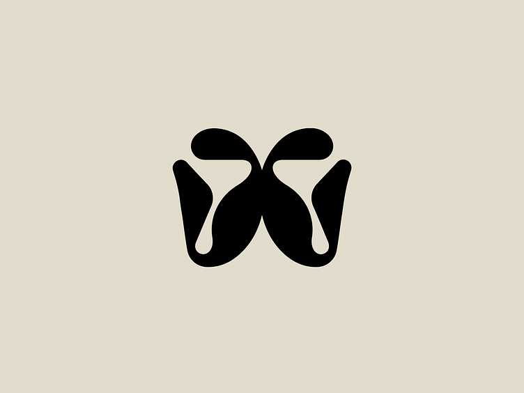
Abstract 'W' Logo Mark Design
Here’s a logo mark concept that pushes the boundaries of simplicity and abstraction. This unique design captures the essence of the letter “W” in a creative and visually impactful way.
What inspired this logo?
The design features flowing, organic shapes that merge together to form a bold and dynamic interpretation of the letter “W.” Its symmetry conveys balance and harmony, while the minimalist style ensures versatility and strong recognition across various branding applications.
Stay tuned for more shots and insights coming soon!
Check out our portfolio: www.wearemaverick.pl
Ready to create together? Let’s talk: contact@wearemaverick.pl
More by Maverick Studio View profile
Like
