Société Générale - internal app
Data Visualization Reimagined for Société Générale 🌟
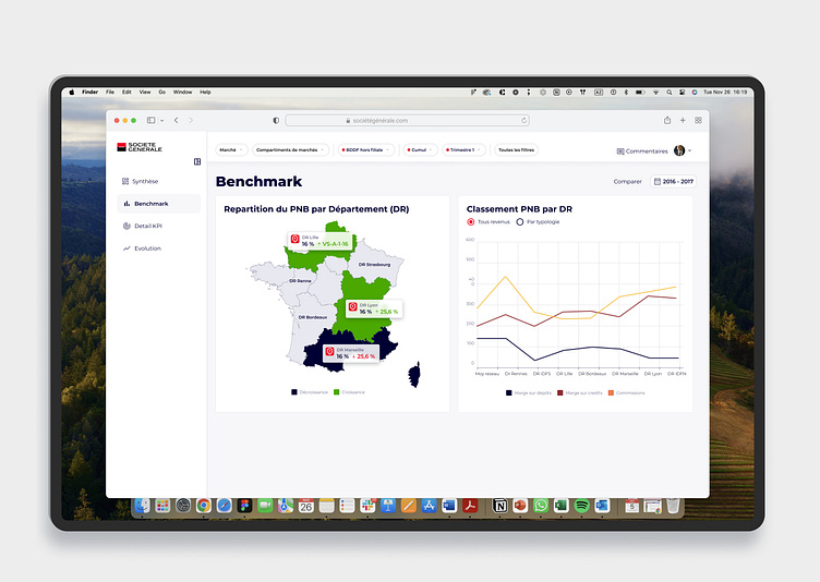
I redesigned this dashboard to make complex financial data not only accessible but also actionable for users. Here's what I improved:
📊 Simplified Data Clarity
Created an interactive map visualization to display regional financial performance (PNB by Département) at a glance.
Highlighted growth (+%) and decline (-%) areas with clear, contrasting colors for immediate insights.
📈 Enhanced Comparative Insights
Introduced a dynamic ranking chart for key metrics, enabling quick comparisons across departments over time.
🎨 Modern & Professional Design
Adopted a clean, intuitive layout aligned with Société Générale's brand identity, ensuring the dashboard looks as polished as it functions.
✨ Key Outcomes
Simplified complex datasets for decision-making.
Improved visual hierarchy for easier navigation and user engagement.
Let me know your thoughts! 👀
