Trading App
About HKCM
HKCM is a trading app that focuses on providing in-depth market analysis without offering direct trading recommendations. The app had to present detailed analyses, example trades, and integrate HKCM news with self-written articles and social media updates.
How I Approach Design Holistically:
When I design a product, I always start by considering the big picture: user needs, business goals, and the competitive landscape. My primary focus for the HKCM app was to create a mobile experience that didn’t just replicate the desktop version but actually offered added value to the user—because, let's be honest, if the desktop version is good enough, why would anyone bother downloading an app?

Strategic Thinking:
I identified that the key opportunity lay in enhancing usability and engagement through snackable, informative and intuitive content. Users of trading apps are often on the go and want quick, actionable insights rather than lengthy reports. Therefore, I proposed a design strategy that revolved around providing bite-sized, informative content in a way that would complement users' fast-paced lifestyles. This wasn’t just about UX; it was about strategically differentiating the mobile app from the desktop version by offering a superior experience tailored for mobile consumption.
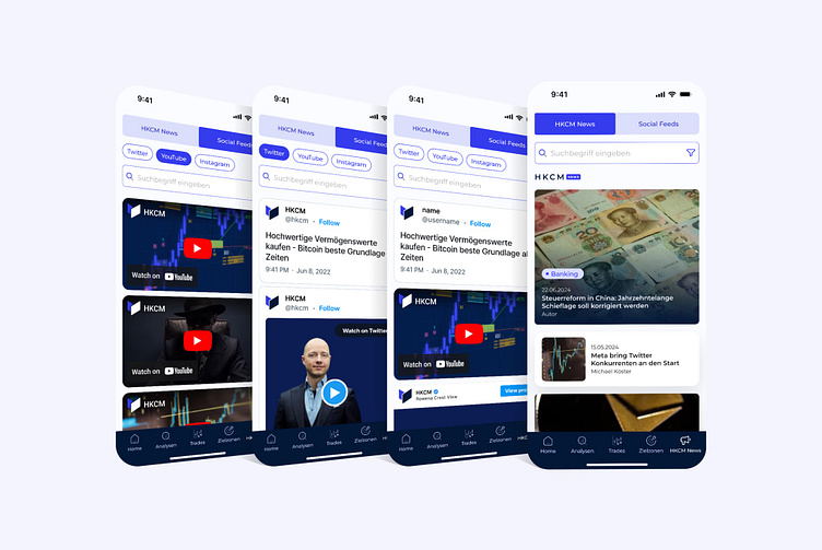
HKCM News - Highlighting Unique Value
HKCM takes great pride in its editorial news section, which is a core differentiator from other trading apps. Unlike competitors, HKCM writes its own market analysis articles, which has significantly boosted its social media presence and credibility. Recognizing the importance of this unique offering, I urged the client to feature their editorial content prominently in the app.
To achieve this, I proposed a segmented control tab that allows users to easily switch between the HKCM News, and social media feeds. This approach ensured that users could access snackable content quickly and intuitively, making the app a go-to resource for staying informed on the go. By focusing on HKCM’s unique strengths—its self-written articles and active social media presence—we not only enhanced the app’s value proposition but also created an engaging user experience tailored to its audience.
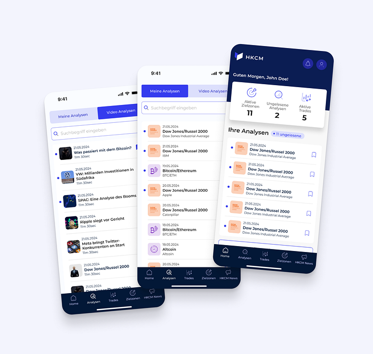
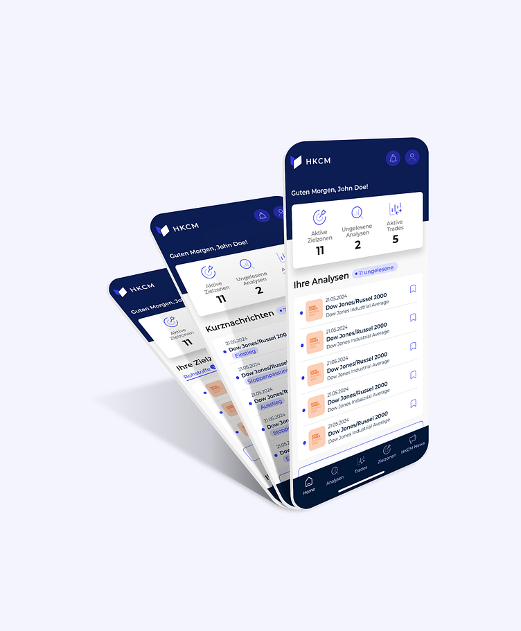
Dashboard
The dashboard was designed to be an intuitive entry point, providing users with a quick overview of critical information. The top-level metrics, such as active trades, unread analyses, and active target zones, were prioritized and displayed prominently to allow users to assess their portfolio at a glance. I ensured that key actions were only one tap away by structuring the dashboard into digestible sections, enabling users to dive deeper into analyses or updates as needed. This snackable, high-level content approach kept users engaged while avoiding information overload.
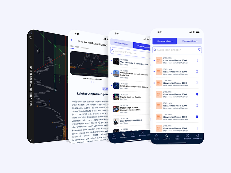
Analyses View
HKCM provides in-depth, self-written market analyses. To support the main feature, I designed the analyses view with a clear visual hierarchy, ensuring that users could easily scan headlines and decide what to read further. A segmented control tab allowed users to switch between different types of content, such as written and video analyses, making it simple for users to access the format they preferred. I incorporated a fullscreen chart analysis view, which enables users to pin and pinch to zoom in and scroll through the candle charts, providing a dynamic and interactive way to analyze market data.
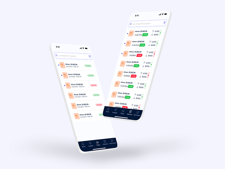
HKCM Trades
The trades view needed to present real-time data in a way that was easy to interpret quickly. I used a clean, minimalist layout with clear data points, focusing on key metrics like current price, percentage change, and trend direction. Filters and search functionality were prominently placed to help users quickly find specific trades or products they were interested in. My goal here was to ensure that users could make informed decisions efficiently without being overwhelmed by too many options or complex graphs.
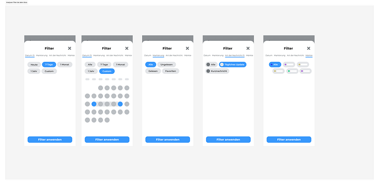
Filter
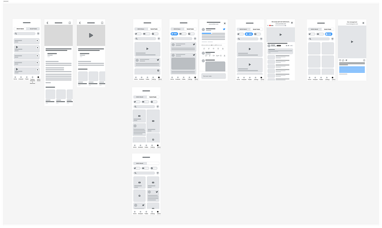
I underestimated the filter function 😅 I faced a significant challenge with it for markets and stocks. The filters were interdependent, and selecting specific markets caused most stocks to disappear, which was a UX disaster since users expected access to all purchased packages. To address this, I researched similar issues using Mobbin and discovered that Klarna had faced a similar problem.
Additionally, I referred to Google Material 3, which employs a neutral hyphen in checkboxes to indicate incomplete selections.
Using these insights, I designed a filter that combined markets and shares. I listed markets as primary list items and placed shares in a submenu with checkboxes. This approach allowed users to see all their options without confusion and improved the overall user experience. The solution was well-received and effectively resolved the issue.