Toyota Bangladesh website hero section
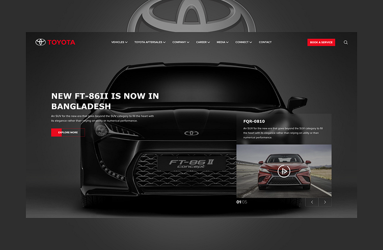
In 2021, COdesign had the privilege of revamping Toyota Bangladesh's website, making it the first in the region to adopt Toyota's new global brand guidelines. We are honored to have been entrusted by Toyota to lead this significant transformation and deliver a modern, user-centric digital experience.
1. Visual Hierarchy
Hero Section Focus: The design places the car's image front and center, immediately grabbing attention. The bold and minimalistic typography complements the visual focus on the product.
Clear Call-to-Action (CTA): The "Explore More" button stands out in red against the dark background, encouraging users to take action.
2. Branding
Logo Placement: The Toyota logo is prominently displayed in the top-left corner, reinforcing brand identity.
Consistency: The color palette (red, black, and white) aligns with Toyota's branding, creating a cohesive look.
3. Content Organization
Headline and Subtext: The headline "NEW FT-86II IS NOW IN BANGLADESH" is large and impactful, with supporting text providing additional details without overwhelming the user.
Carousel Section: The smaller card on the right, featuring the FQR-0810, allows for showcasing multiple products or features in a compact space while keeping the hero section clean.
4. Navigation
Well-Defined Menu: The top navigation bar is clean and organized, offering quick access to Vehicles, Aftersales, Careers, and more.
Search and Service Options: The search icon and "Book a Service" button provide utility for users looking for specific information or actions.
5. Aesthetics
Dark Theme: The dark background adds sophistication and makes the car's details pop, enhancing the overall visual appeal.
Modern Typography: The sans-serif font is clean and modern, aligning with Toyota's image as a forward-thinking brand.
Balance of Elements: The layout is well-balanced, with sufficient negative space preventing the design from feeling cluttered.
6. Media Integration
The small video thumbnail with a play icon invites interaction, hinting at dynamic content like product videos, which can engage users more effectively.
This design effectively communicates luxury, innovation, and elegance while providing a user-friendly experience tailored to Toyota's audience.
Big shout out to Muhammed Imran for the brilliant execution behind this!
