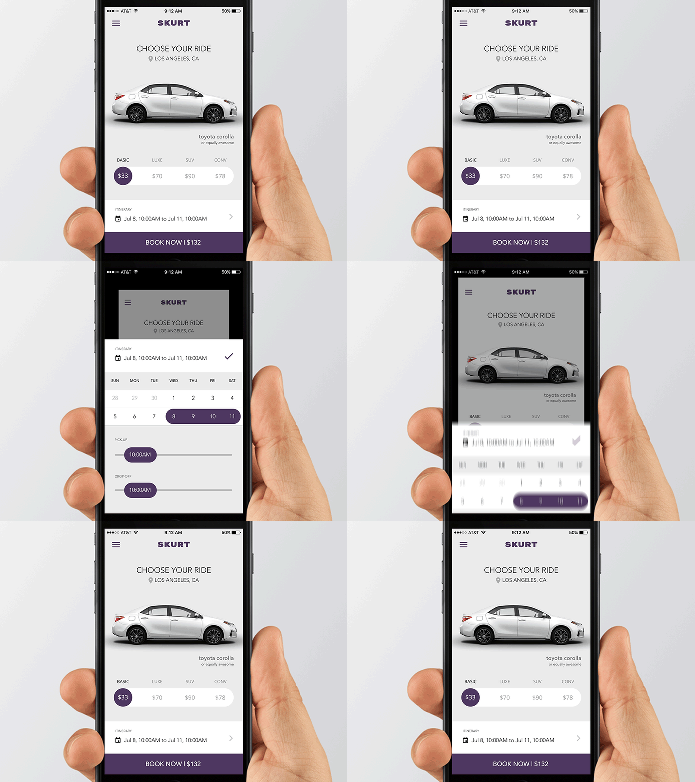
SKURT iOS App UX Revision
Last year we helped the fine folks at SKURT as UX consultants. This was one of the experiments with their booking flow. Animation made in After Effects.
What we were trying to solve:
1 - make a cleaner look and feel (it was too dark before)
2 - reduce the number of steps to make a booking
3 - make the "pick a car" screen the first screen the user sees.
You can check the old version here.
More by HOP Design View profile
Like
