VUA HOA | LOGO DESIGN & BRAND IDENTITY
Flowers are gifts from nature, but for foreign blooms to traverse thousands of miles and reach the hands of flower lovers in Vietnam, they need more than just beauty — they require devoted care.
For Vua Hoa, a young brand with grand aspirations, importing premium flowers is not merely a business but also a way to inspire local flower shops. Each flower must not only be beautiful but also meet the highest standards to assert the brand's position in this highly competitive field.
In a conversation with the owner of Vua Hoa, the most striking moment was when he shared: “Enough colors, flowers will bloom; enough wind, clouds will soar; enough class, Vua Hoa will radiate!”
Unpretentious and without unnecessary grandeur, Vua Hoa is in the process of “cultivating its colors.” He inspired us to design a mark that feels approachable and refined, enough to showcase the brand’s quality, which is blossoming day by day.
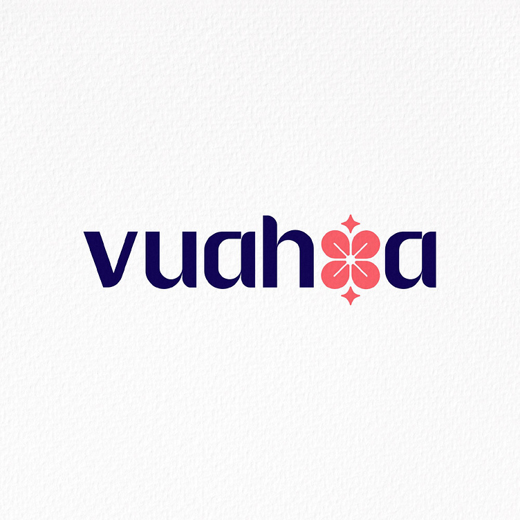
Vua Hoa’s logo features a clean, modern sans-serif font that exudes accessibility and friendliness. The letter ‘o’ is elegantly stylized into a blooming flower, highlighting the brand’s essence while symbolizing the meticulously curated flowers, each selected to achieve perfection. The contrasting hues of pink and deep green create a fresh, vibrant impression — as if every bouquet from Vua Hoa lights up any space it graces.
Designed by Bee Art
-
Client Vua Hoa
Logo Design Project. Logo is designed for importing flowers brand.
Copyright© Bee Art. All Right Reserved
Contact us:
• Hotline/ Zalo: (+84) 77 34567 18
• Email: info@beeart.vn
• Website: www.beeart.vn


