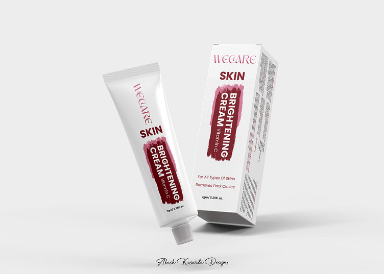
Packaging Design for WeCare Skin Brightening Cream
Design Insights: WeCare Skin Brightening Cream Packaging
As a graphic designer, crafting the packaging design for "WeCare Skin Brightening Cream" was an exciting challenge, blending aesthetic appeal with brand messaging. This design needed to communicate the product's core benefits while capturing the attention of a modern audience. Here’s how the design elements came together.
The base of the design employs a clean white background to evoke simplicity and purity—qualities strongly associated with skincare products. The choice of maroon as the accent color was intentional, as it conveys a sense of sophistication and confidence while creating a stark contrast against the white. This ensures that key elements, like the product name and benefits, immediately draw attention.
A bold, dynamic paintbrush stroke serves as a backdrop for the text, breaking the monotony of a flat design and adding a touch of creativity. It symbolizes transformation, aligning with the product’s promise of skin brightening. The typography further enhances the design. The brand name “WeCare” is styled in a sleek, modern font, while the product name and benefits are in bold, uppercase letters to prioritize readability and create a hierarchy of information.
To maintain brand consistency, both the tube and box mirror each other in design and layout, making them instantly recognizable as a pair. The tagline “For All Types of Skins” and the benefit “Removes Dark Circles” were strategically positioned to highlight inclusivity and effectiveness, addressing key concerns of potential buyers. The detailed yet unobtrusive layout on the box’s side ensures that the consumer receives all the necessary information without feeling overwhelmed.
This packaging was designed to not just stand out on shelves but also to resonate with the target audience. It reflects the brand's commitment to quality and care while ensuring an engaging visual experience—an essential factor in today’s competitive skincare market.
