CreativeCove - Branding Agency Website Design.
CreativeCove: Branding Agency Landing Page Design.
Introduction
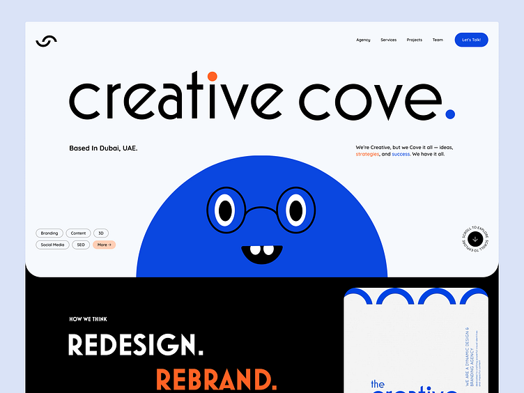
The Creative Cove landing page is a dynamic and visually captivating space that invites users into a world of design innovation and strategic creativity. This case study delves into the thought process behind its creation, emphasizing user-centric design, aesthetic harmony, and seamless navigation.
The Story Behind the Design
Our goal was to create a digital environment that not only reflects Creative Cove's brand essence but also provides an intuitive and engaging user experience. We aimed to blend playful visuals with professional undertones, ensuring that every visitor feels welcomed and intrigued.
Redesign. Rebrand. Rethink.
At the core of Creative Cove's philosophy is the triad of redesign, rebrand, and rethink. This mantra is vividly represented on the landing page through bold typography, interactive elements, and a cohesive color palette. Each section is designed to lead users through a journey of discovery, from understanding the brand's vision to exploring its diverse portfolio.
Full Design
Structure and Layout
Hero Section
The hero section features a bold introduction with a playful Brand Persona, instantly capturing attention. The clean layout, combined with a strategic use of white space, draws focus to the brand’s core message Values, and services.
Our Work
This section showcases Creative Cove's diverse portfolio, emphasizing the transformative nature of their projects. Each project thumbnail is thoughtfully designed to provide a snapshot of the work, encouraging deeper exploration.
Services & Approach
Here, we detail Creative Cove's comprehensive suite of services. The layout is intuitive, with icons and brief descriptions that help users understand the scope of each service. The emphasis on "Going Beyond the Comfort Zone" highlights the brand's commitment to innovation and excellence.
Visual Design Elements
Color Palette
The use of soft blues (#E9F0FF), vibrant oranges (#FF6224), and deep blues (#0A47E0) creates a harmonious and inviting visual experience. These colors strategically guide users' attention and evoke specific emotions.
Typography
The combination of Mostra Nuova Heavy for headlines and Quicksand for body text ensures readability and maintains a modern, clean aesthetic. This typographic hierarchy supports the overall design narrative, balancing boldness with subtlety.
Visual Design Elements
Interactive Elements
Interactive elements, such as hover effects and clickable icons, enhance user engagement. These features are designed to provide immediate feedback, making the navigation experience intuitive and enjoyable.
Brand Personas
Including distinct brand personas—Strategist, Social Savvy, Space Planner, and Creative—adds a playful and relatable dimension to the design. Each character embodies a unique aspect of Creative Cove's approach, making the brand more personable and memorable. These personas help users connect with the brand deeper, enhancing their overall experience.
Conclusion
The Creative Cove landing page is more than just a digital storefront; it’s a testament to the brand’s dedication to design excellence and user-centric solutions. By seamlessly blending visual storytelling with functional design, we have created a platform that attracts and retains user interest.
This case study highlights the meticulous attention to detail and strategic thinking that went into crafting the Creative Cove landing page, ensuring it stands out in a competitive digital landscape.
All brand guidelines and design elements are the intellectual property of CreativeCove_UAE Unauthorized use or reproduction is prohibited.


