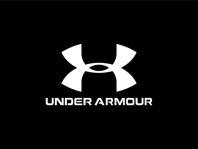
Under Armour Logo Redesign
Hi Dribbblers
The Under Armour logo is undeniably iconic, but I’ve always felt its aesthetic could use some refinement. So, I decided to take on the challenge of reimagining it!
I started by breaking it down with grids, focusing on achieving better balance, symmetry, and proportions. After experimenting and refining the forms, I arrived at a result that feels more dynamic, polished, and aesthetically pleasing.
This redesign reflects my approach to precision and modern visual harmony. Let me know your thoughts! Feedback is always appreciated!
More by Nikoloz Narsia View profile
Like


