Construction Logo Branding
Urbanix: A Comprehensive Branding Design that Redefines Modern Living
In the ever-evolving world of urban development, a strong and cohesive brand identity is vital to stand out. The "Urbanix" branding design perfectly embodies the essence of innovation and community building, showcasing a refined approach to modern living and architecture. Let’s explore how this branding design achieves its objectives and resonates with its audience.
The Logo: A Minimalist Yet Powerful Identity
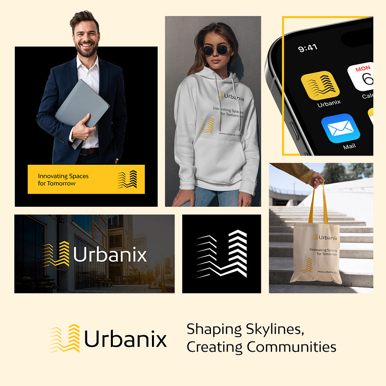
The Urbanix logo is the cornerstone of this branding. Featuring three ascending, zigzag-like lines in a golden-yellow hue, the design evokes imagery of high-rise buildings and upward growth—a fitting metaphor for the company’s mission to innovate and shape urban spaces. This clean, geometric design pairs seamlessly with the modern sans-serif typography of the brand name, creating a polished and professional appearance.
The logo’s duality of color—yellow and black—offers versatility for both digital and print media. It effectively communicates vibrancy and sophistication, making it adaptable for various applications while retaining its core identity.
Taglines and Messaging
The primary tagline, “Shaping Skylines, Creating Communities,” complements the brand’s visual identity by emphasizing its dual focus: architectural innovation and fostering connection. A secondary line, “Innovating Spaces for Tomorrow,” underscores the forward-thinking ethos of the company, reinforcing its commitment to the future.
These carefully crafted phrases align seamlessly with the logo’s visual message, ensuring consistency and clarity across all branding elements.
Applications Across Platforms
The versatility of the Urbanix branding is evident in its real-world applications, as showcased in the following formats:
Corporate Presence: The branding is tailored for professional contexts, such as business cards, signage, and corporate presentations. The black-and-yellow palette exudes confidence and authority while maintaining a contemporary edge.
Merchandise: From hoodies to tote bags, the Urbanix branding translates effortlessly to apparel and accessories. The clean design makes the brand recognizable and appealing to a broader audience, enhancing brand visibility in everyday settings.
Digital Platforms: The app icon adaptation demonstrates how the logo functions in the digital realm. The icon’s clarity at small sizes ensures it remains effective on mobile interfaces, extending the brand’s reach to tech-savvy consumers.
Environmental Branding: With a focus on urban living, the branding integrates well with real-world architectural backdrops, as evidenced by its use in photography of modern cityscapes.
Color Psychology
The primary color—golden yellow—represents optimism, energy, and creativity, aligning with the company’s vision of bringing innovation to urban development. Black provides a grounding contrast, evoking strength and reliability.
This strategic color pairing not only enhances aesthetic appeal but also reinforces the values Urbanix aims to project: a dynamic yet dependable brand.
Final Thoughts
The Urbanix branding design is a masterclass in modern identity creation. By marrying a minimalist aesthetic with meaningful messaging, the design encapsulates the brand’s mission to innovate urban spaces and build thriving communities. Its adaptability across various mediums—from corporate materials to lifestyle merchandise—further solidifies its place as a memorable and impactful identity in the competitive field of urban development.
Urbanix doesn’t just shape skylines; it redefines how a brand can visually and emotionally connect with its audience, setting a new benchmark for excellence in branding design.


