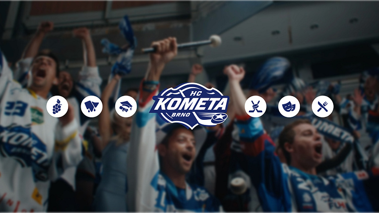
Kometa - digital rebrand
Kometa
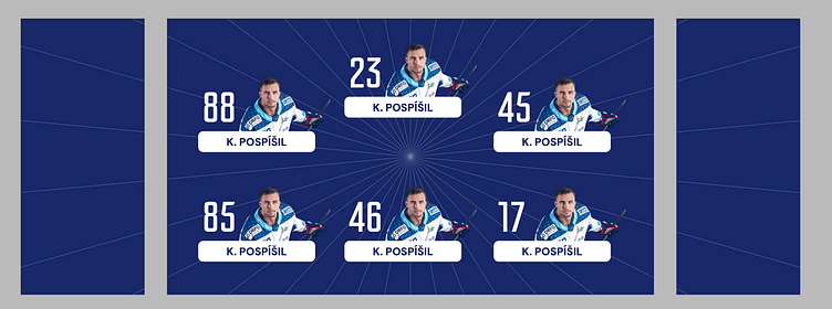
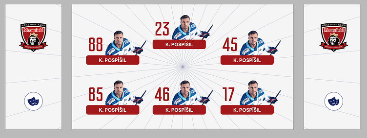
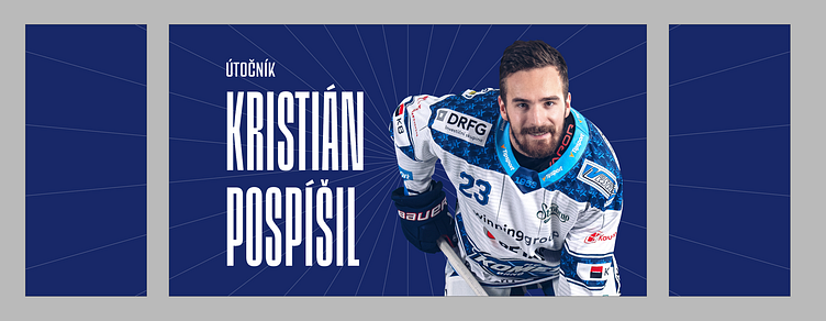
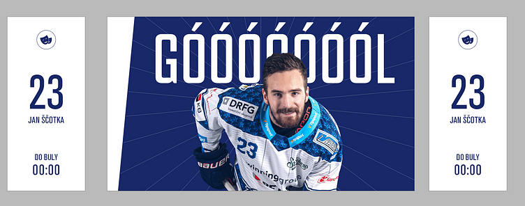
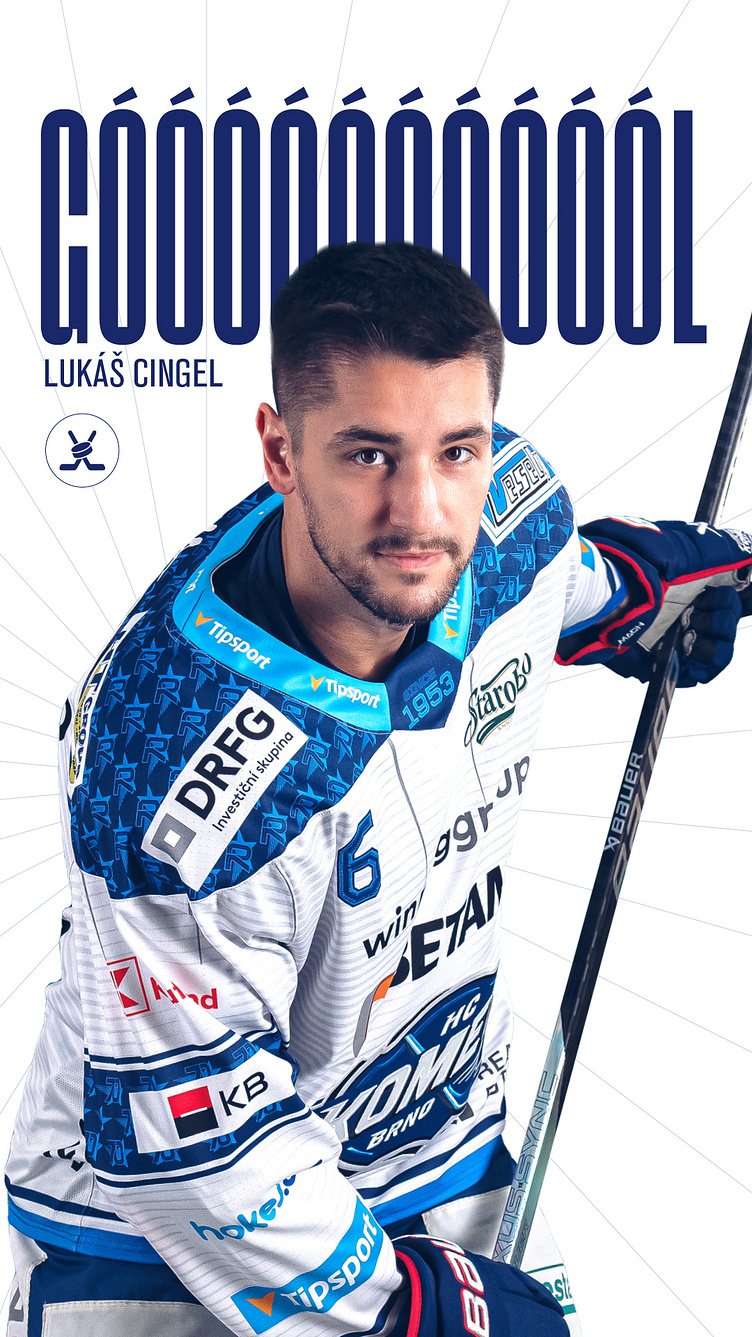
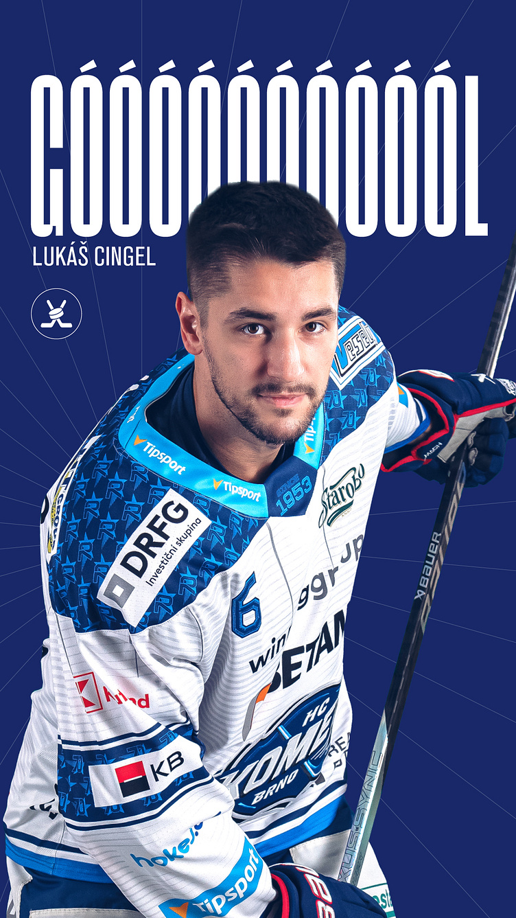
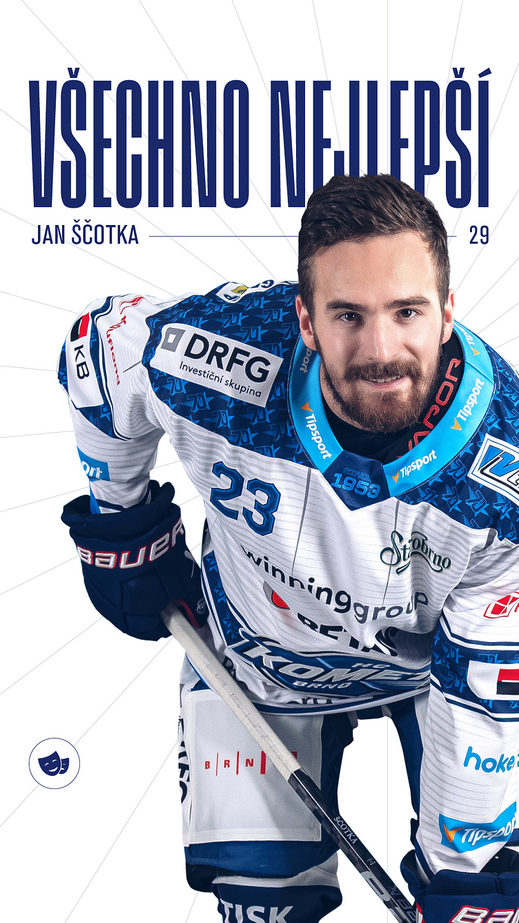
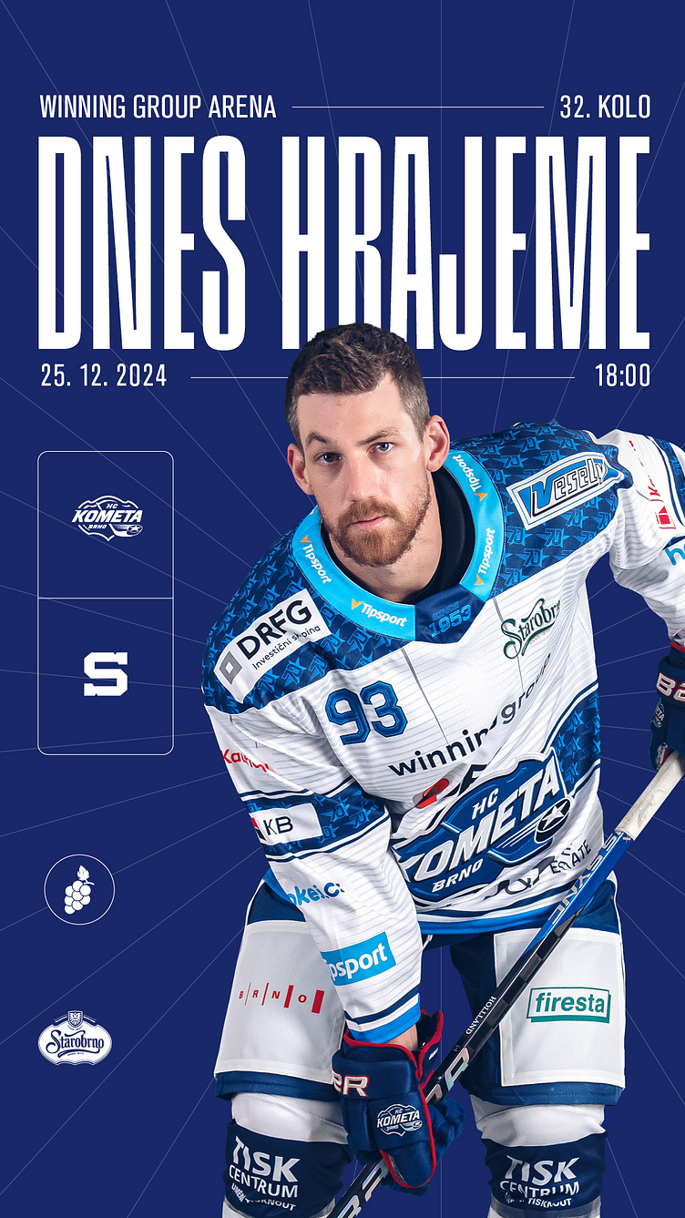
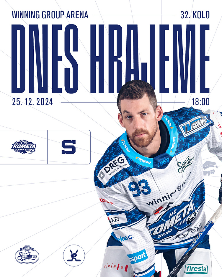
Rebranding visuals for Kometa Brno was a journey into minimalism—stripping away the unnecessary to emphasize the essence of the team’s identity. Clean lines, simplified elements, and a modern approach ensure the visuals resonate with both tradition and contemporary appeal, letting the passion for hockey shine through unfiltered
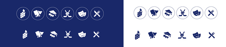
vector elements
3D rendered hockey pucks for animation on the stadion
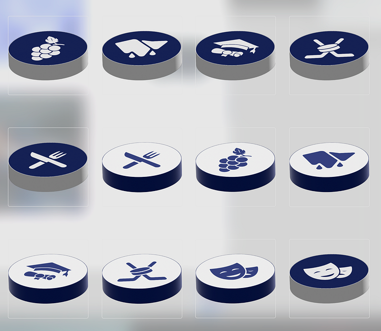
Hockey cube
This cube design combines dynamic visuals, high-performance branding, and a deep understanding of the sport’s energy. My goal was to capture the spirit of hockey while delivering a visually striking and functional design, tailored to engage and inspire both players and fans