CELLO - Healthy Pickle Store Landing Page
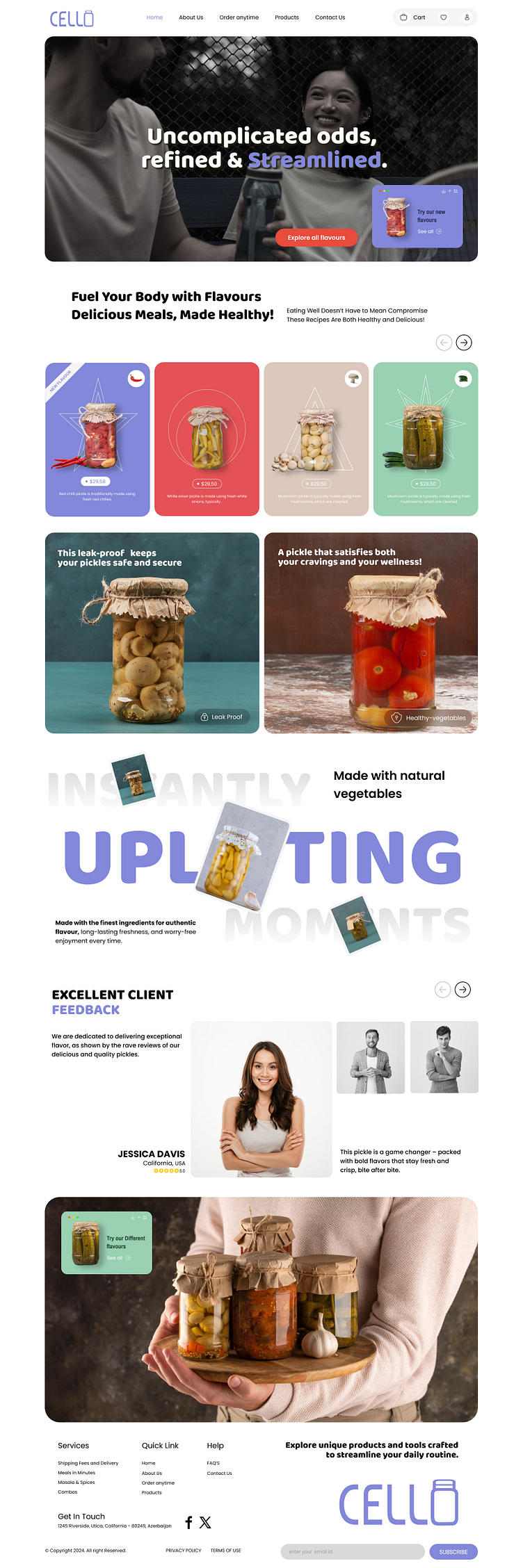
This modern and visually striking concept landing page design for Cello reflects the perfect balance between elegance and functionality. The design focuses on delivering a seamless user experience with a clean, well-structured layout that ensures smooth navigation and highlights key offerings. The typography features sleek sans-serif fonts, creating a contemporary and approachable look while enhancing readability.
The color palette blends soft pastels with vibrant accents, perfectly complementing the brand’s identity. Pastel tones exude freshness and simplicity, while bold pops of red in the call-to-action buttons draw the user’s attention to important interactive elements. The combination of these colors creates an inviting and aesthetically pleasing visual experience.
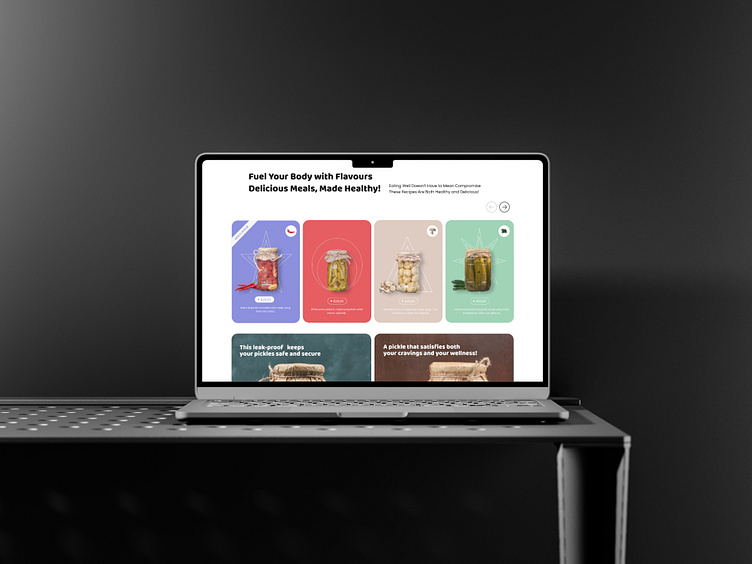
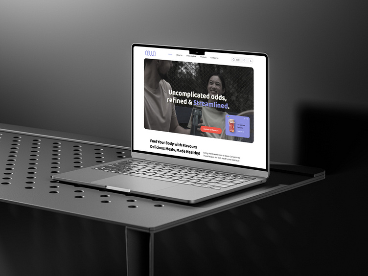
High-quality product imagery plays a central role in this design, showcasing the pickled products in a way that immediately appeals to users. These visuals are paired with thoughtfully placed text, making the content both engaging and informative. The carefully chosen whitespace balances the vivid elements, ensuring a clean and uncluttered aesthetic.
This landing page isn’t just visually captivating—it’s also highly functional. From strategically placed call-to-action buttons to a grid-based layout that enhances content flow, every element has been designed to create an intuitive and enjoyable user journey. The design encapsulates Cello’s brand essence, making it attractive to health-conscious users looking for unique and delicious options.
Tools: XD, Adobe Photoshop, Adobe Illustrator, Figma
For work inquiry, Say hello 👋 or Drop a line at 📩 hello@virtualcoders.net or Visit Us at - Virtual Coders
Follow us for more amazing designs : Instagram || Behance
Love what you see? Drop a ❤️ and share your thoughts!
Let’s bring this concept to life together.
