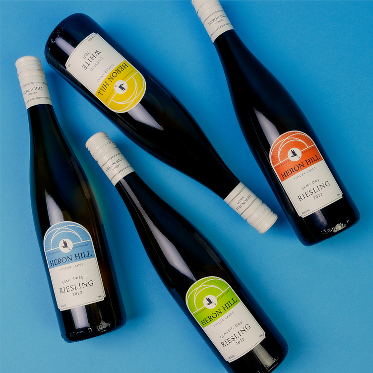
Heron Hill Main Line Label Redesign
Enter your text here...Since its beginning in 1972, Heron Hill winery has been at the forefront of Finger Lakes winemaking, specializing in multiple varietals of wine. Heron Hill approached Watermark to refresh their labels with vivid color and a youthful spirit fitting for the contemporary era.
Inspired by their tasting room designed by renowned architect, Charles Warren, the label itself mirrors the roofline of the tasting room, a symbol of innovation. At the center of the arches is Heron Hill’s silhouetted Heron logo tying the former labels to these newly refreshed labels.
Varietals are distinguishable by bold colors jumping off the white background, with a classic layout to marry the contemporary with the traditional. A matching white capsule ties the full package together in a manner that exudes everyday luxury.


