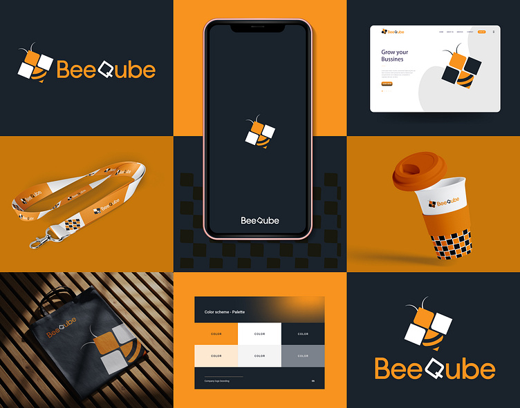
BeeQube Logo Design, Branding, Brand Identity design
BeeQube – Logo Concept (Briefly)
🐝 Bee: A symbol of productivity, teamwork, and efficiency. Represents business collaboration and speed through the ERP system. The four blocks form a bee shape, with stripes enhancing its identity.
🔲 Qube: Represents structure, stability, and modular ERP solutions. The "Q" design reflects technology and flexibility.
🎨 Colors: 🟠 Orange – Innovation & Efficiency ⚫ Black – Professionalism & Strength
🚀 Message: The BeeQube logo symbolizes the speed, collaboration, and modular structure of ERP, making businesses more efficient and connected.Heading
Let's talk about your project.
just message me or Gmail me for any project inquiries or commission works
Whatsapp : +966546524826
Gmail: mshakilahmed46@gmail.com
My Social Media
COPYRIGHT © 2025 Shakil Rehan
