Focus Gallery Further Page
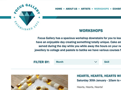
The challenge of Toni's design was making the header work beyond the homepage. It's great to have an impactful hero header on the homepage but once you're further into the website, I felt it was more important to get to the information quicker.
My solution was to keep the logo in the circle but add a bar that took up less space but continued the clean break between the navigation and content.
I've also continued to keep the typography quite bold to be in keeping with the branding.
More by Katherine Cory View profile
Like

