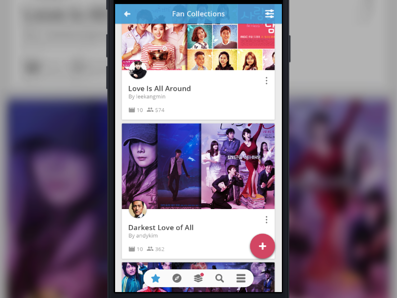
Fan Collections Screen with Floating Action Button (FAB)
I want to see if the FAB (Floating Action Button) fits well with the simple navigation bar. I think it's looking good. We're planning to adopt Google Material Design to iOS app as well.
Compare this with the current screen design by the other designer: https://www.dropbox.com/s/puyoozymt2oxxik/iOS%20Collection%20Screen%2023%20Feb%202016.png?dl=0
FAB Spec on Google Material Design: https://www.google.com/design/spec/components/buttons-floating-action-button.html
I grabbed the posters from a pinterest account and modified them (combined, put some shadows, gradient overlay): https://www.pinterest.com/kdramalover/korean-drama-posters/
posted via invisionapp.com
More by Borrys Hasian View profile
Like
