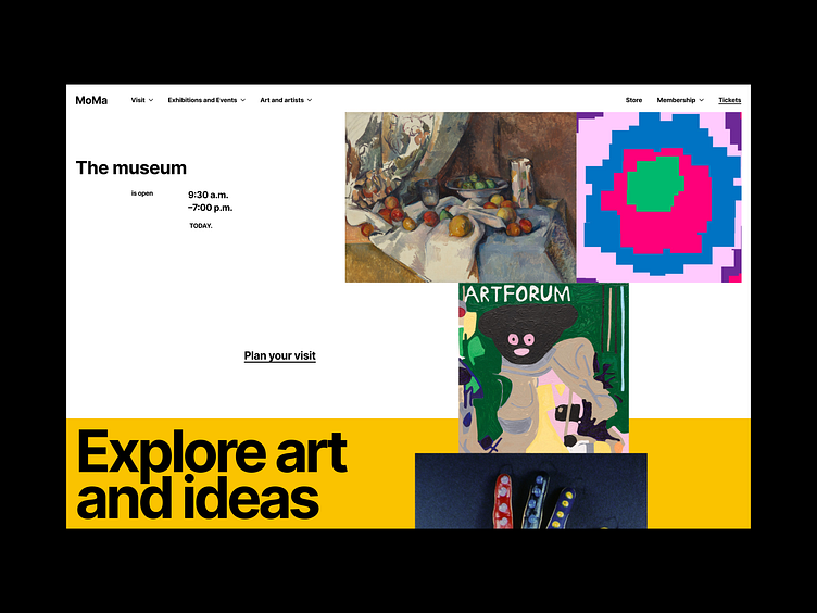
Layout Exploration / MoMa
At The Museum of Modern Art and MoMA PS1, we celebrate creativity, openness, tolerance, and generosity. We aim to be inclusive places— both onsite and online—where diverse cultural, artistic, social, and political positions are welcome. We’re committed to sharing the most thought-provoking modern and contemporary art, and hope you will join us in exploring the art, ideas, and issues of our time.
Source: https://www.moma.org/about/
Design Concepts
When creating these concepts, I paid the main attention to the grid and the overall composition. Everything should look chaotic, abstract, but at the same time systematic and clean.
Using a unique composition, I add chaos to the layout and create contrast/hierarchy.
The first 3 things that the user should notice on hero section are:
—Title,
—Image of the works,
—Subheading "museum".
These 3 key elements will immediately tell the user what website he is on. Each individual page of the project will have its own unique color on the first screen.
An interesting solution is to flip the image in the mobile version. By doing this you can show the full work without any cropping.
Thank you for watching!
Press "L" to like this shot 💖
And let me know your thoughts 💭
Socials: 📲
Email: 📬


