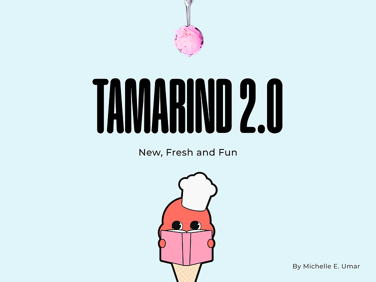
Tamarind 2.0: Ice Cream Brand Home Page
Tamarind is a personal project I created for my Creative Shot series. The goal was to design a homepage for an ice cream brand that felt fun and drew inspiration from the Neubrutalist design style. Although I published the first version, I wasn’t happy with the outcome. The colors and fonts didn’t feel right, and overall, it just didn’t meet the standards I set for myself.
Knowing I could do better, I decided to update the design. Now, I’m excited to share Tamarind 2.0—a design that finally captures the vibe I was aiming for: fun, playful, and exciting.
More by Michelle Enakeno U View profile
Like


