Nike UI Redesign
Case Study: Nike Website Redesign
1. Introduction
Project Title: Nike Website Redesign
Objective: To create a visually immersive, user-friendly interface that enhances the shopping experience and highlights Nike's products effectively.
Role: UI/UX Designer
Tools Used: Figma
2. Problem Statement
Current Challenges:
Lack of focus on hero products in the product listing pages.
Need for a more dynamic and modern layout to align with Nike's branding.
Insufficient interactive features to keep users engaged.
3. Design Process
a. Research and Analysis
Conducted competitor analysis of leading e-commerce platforms (e.g., Adidas, Puma).
Gathered insights from user feedback on shopping habits and preferences.
b. Ideation
Focused on three core elements:
Visual storytelling with hero products.
Minimalist yet impactful navigation.
Dynamic content and responsiveness for mobile and desktop devices.
c. Wireframing
Created low-fidelity wireframes to map the user journey:
Homepage emphasizing flagship products.
Interactive product carousel for smooth navigation.
d. Visual Design
Incorporated glassmorphism effects for a modern aesthetic.
Used Nike's brand palette: Black, white, and accent colors (red and neon).
Added sleek typography ("JUST DO IT.") to align with Nike's bold identity.
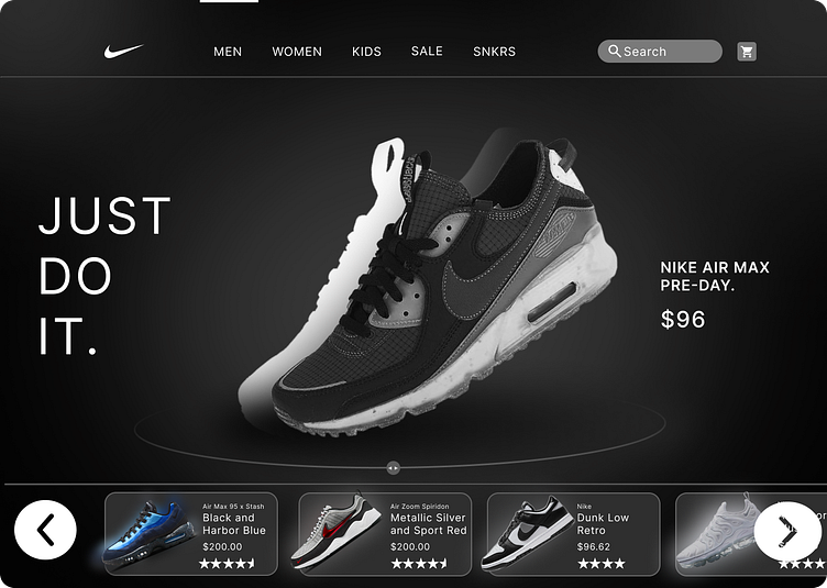
4. Key Features of the Design
Hero Section:
Showcases Nike Air Max Pre-Day shoes with high-quality 3D visuals.
Large typography to grab attention (“JUST DO IT.”).
Interactive Product Carousel:
Allows users to seamlessly browse through similar products.
Highlights key product details like price, ratings, and variants.
Minimal Navigation Bar:
Focuses on essential categories (Men, Women, Kids, Sale).
Search bar and cart icons placed for intuitive navigation.
Call-to-Actions (CTAs):
Prominent “Add to Cart” and “Buy Now” buttons for quick purchase.
5. Challenges Faced
Balancing aesthetics with usability without overwhelming the user.
Ensuring the layout is responsive and provides a consistent experience across devices.
6
. Final Outcome
Successfully created a visually compelling and user-centric design.
The interface effectively conveys Nike's brand identity while ensuring seamless navigation.
7. Lessons Learned
Importance of user research in shaping design decisions.
Iterative testing is key to refining interactive features.
8. Conclusion
This project allowed me to explore innovative design trends like glassmorphism while staying true to Nike's iconic branding. The end result is a modern, engaging interface that elevates the user's online shopping experience.
