Fitness Logo Design
PulseFit Branding Design
Igniting Power Through Visual Identity
In the competitive fitness industry, a strong and memorable brand identity can set a business apart from the crowd. PulseFit, a dynamic fitness brand, exemplifies how cohesive and impactful design can resonate with the target audience. Let’s delve into the details of this branding masterpiece that combines energy, power, and functionality.
Logo Concept: Energy in Motion
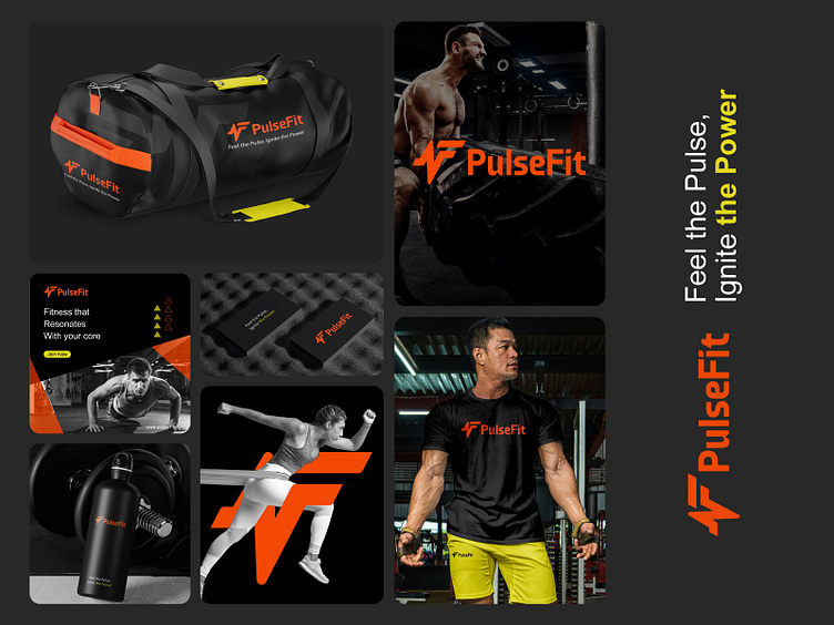
The PulseFit logo is the cornerstone of the brand’s identity. Featuring a bold, angular "F" with an integrated lightning bolt, it symbolizes energy, movement, and intensity. The sharp edges and clean lines reflect strength and precision, aligning perfectly with the core values of a fitness brand focused on performance and progress.
The logo’s typography complements the icon with a modern sans-serif font. The clean design ensures legibility and scalability across various applications, from digital platforms to physical merchandise.
Color Palette: Vibrance Meets Strength
The color palette revolves around two dominant hues:
Fiery Orange: A vibrant, energetic color that represents passion, motivation, and action.
Lime Green: A secondary accent color used sparingly to highlight power and growth, injecting freshness into the visual identity.
These colors are grounded by neutral black and gray tones, which add sophistication and balance while allowing the bright colors to stand out.
Tagline: Feel the Pulse, Ignite the Power
The tagline encapsulates the brand’s essence—to connect with its audience on a visceral level. It emphasizes the physical and emotional impact of fitness, encouraging individuals to channel their inner strength and power through PulseFit.
Application Across Collateral
The branding extends seamlessly across various touchpoints:
Apparel: The logo and colors are prominently featured on t-shirts and workout gear, ensuring that wearers feel part of an empowered community.
Accessories: From gym bags to water bottles, every item is designed with functionality and aesthetic appeal, making them practical yet stylish.
Business Cards: The sleek design, using a black background with orange accents, ensures a professional and lasting impression.
Digital Media: The branding comes to life in social media templates and website visuals, using high-contrast images and dynamic layouts to captivate audiences.
Imagery: Strength and Movement
The brand’s visual storytelling is rooted in high-energy photography. Images of athletes performing intense workouts convey strength, discipline, and dedication. Combined with the bold logo and vibrant colors, these visuals create an inspiring narrative.
Why PulseFit Stands Out
PulseFit’s branding strikes the perfect balance between aesthetics and functionality. The design appeals to both fitness enthusiasts and casual gym-goers, creating an aspirational yet approachable image. By emphasizing energy, power, and community, the brand inspires individuals to push their limits and achieve their fitness goals.
PulseFit’s branding is a masterclass in creating a compelling visual identity. Every element, from the logo to the tagline, works cohesively to communicate the brand’s values and mission. For businesses seeking to make an impact in the fitness industry, PulseFit serves as a shining example of how thoughtful design can drive success and resonate with audiences.


