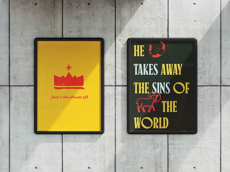
The Greatest Gift
Reflecting on the Christmas campaign we just wrapped up for Cru, I realized it pushed me quite a bit. The challenge was to create something more festive that appealed to families while still being somewhat on brand. Carrying the traditional Cru yellow throughout was a main staple to help bridge the new imagery and expanded color pallet. I had a blast working with the team in creating something more human and playful while avoiding it looking too "childish". Going against my default of clean vectors and leaning into messy, imperfect illustrations was a nice change of pace, one for which I am proud of the final product.
More by Salem Peters View profile
Like
