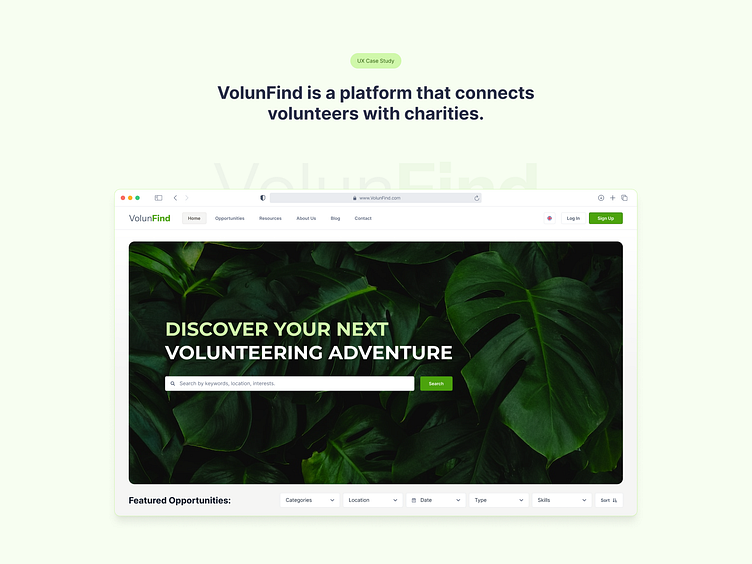
VolunFind is a platform that connects volunteers with charities.
Problems & Goals
Problems:
1. Difficulty finding volunteer opportunities close to home or work.
2. Lack of effective location-based search and interactive maps.
3. Limited access to relevant information discourages potential volunteers and reduces community engagement.
Goals:
1. Create a user-friendly platform for discovering nearby volunteer projects.
2. Integrate location-based search and interactive maps to simplify the process.
3. Boost community engagement by making volunteer opportunities easier to discover and join.
My role:
UI/UX Designer and Researcher
Responsibilities:
User Research: Studied the needs of people looking for volunteer opportunities nearby.
Wireframing: Drew simple page layouts to plan the design.
Prototyping: Created interactive models of the site to test ideas.
Usability Testing: Checked if users found the site easy to use and made improvements.
Design: Developed the site’s appearance—colors, fonts, and other elements.
User research: summary
Online Surveys: To understand potential volunteers’ needs, I conducted an online survey.
Initial Assumptions: I thought the main barrier was general unawareness of volunteer opportunities.
👀 What I Discovered:
Location Matters: People struggle to find volunteer work near their home or workplace.
Desire for Convenience: They want interactive maps and location-based searches.
Need for Advanced Filtering: Users seek advanced filters to match opportunities with their interests and skills.
These findings led me to design VolunFind with location features and advanced filtering to make finding suitable volunteer projects easy and convenient.
User journey map
Sitemap
Digital wireframes
The wireframe was designed to create a clean, user-friendly homepage where users can easily find volunteer opportunities, with improvements based on feedback to enhance category visibility and encourage newsletter subscriptions.
Low-fidelity prototype
The low-fidelity prototype includes key screens like the homepage, search results with a map, and project details, with a streamlined user flow for searching, viewing, and applying based on feedback.
Usability study: parameters
Study type:
Unmoderated usability study
Location:
Ukraine, remote
Participants:
5 participants
Length:
15-20 minutes
Usability study: findings
The usability study identified several key insights that can enhance the user experience on the VolunFind platform.
1. Users liked the location-based search but requested more specific filters like time commitment and project type.
2. Users appreciated the interactive map but found navigating between the map and project list confusing, suggesting a simpler flow.
3. Users easily found the Apply button but suggested adding a confirmation message to ensure their application was successful.
Based on feedback, the homepage was redesigned with a bold call-to-action, a background image, and clearer filters to create a more engaging and intuitive user experience.
High-fidelity prototype
The low-fidelity prototype includes key screens like the homepage, search results with a map, and project details, with a streamlined user flow for searching, viewing, and applying based on feedback.


