Day 2/100 | Navio | Logo_ Challenge | 100days100Logos
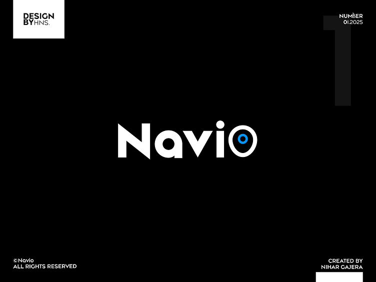
Concept and Purpose: The goal was to create a simple, user-friendly, and easy-to-understand logo for a driver-side ride application.
Name Selection: Chose the name “Navio” as it resonates with navigation, making it relatable for users looking for a navigation-based app.
Design Inspiration: Explored navigation and location-related symbols to incorporate into the design.Creative Decision: Replaced the letter “O” in "Navio" with a location pin icon, adding a visual cue that aligns with the app's purpose.
Final Outcome: A sleek, minimal, and meaningful logo that effectively communicates the app's functionality.
This logo reflects the idea that simplicity in design can still be impactful and memorable.
Thank you all for the love and support on my latest design!
Your feedback means a lot and keeps me inspired.
Stay tuned for more creative work! 🙌🎨
#Grateful #KeepCreating
Linkedin: https://www.linkedin.com/in/nihargajera/

