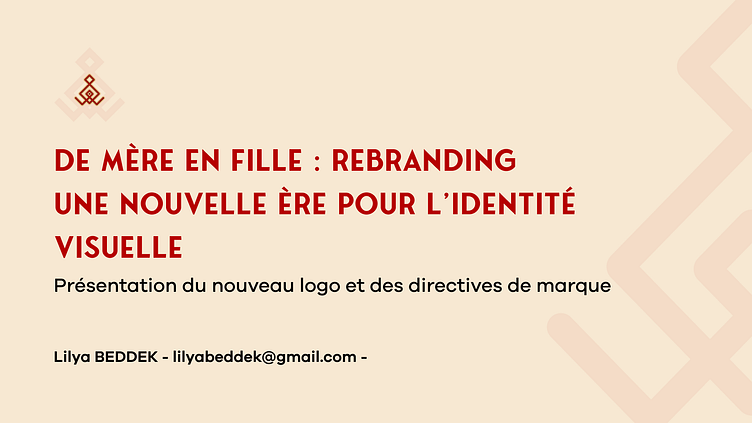
DE MÈRE EN FILLE: Rebranding Visual Identity
Hey guys! Here is another piece of design from me.
The new logo for De Mère en Fille is a visual representation of the brand's core values, blending elegance and depth. Inspired by maternal love, it reflects the tenderness, the sacred bond between generations, and the concept of transmission. Each element of this logo has been thoughtfully crafted to highlight the strength of family ties, while also celebrating heritage and tradition.
To enrich its visual identity, the logo subtly incorporates Berber art. Traditional motifs, with their geometric lines and graceful curves, add a unique cultural touch rooted in a rich heritage. These ornamental elements pay tribute to the brand's deep roots while infusing a sense of modernity, creating a perfect fusion between the past and the future.
This logo does not simply represent a brand; it tells a story of transmission, pride, and love, all while remaining anchored in a timeless and universal aesthetic.
----------------------------------------------------------------
Show some love by pressing "L" or "Heart" button because your support will inspire me to do more creative design works. ❤️
I am available for Projects : lilyabeddek@gmail.com
----------------------------------------------------------------
Follow me on: 👇 Behance | Instragramere...


