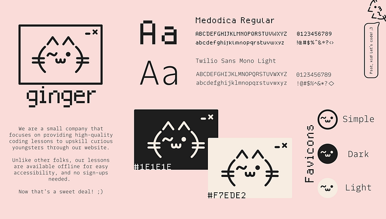
Logo Design No. 1: Ginger
Hey, Peeps!
Here's my first logo design for a fictional company named Ginger from a brief taken from goodbrief.io.
The Brief:
1] Company Name: Ginger
2] Product: Website for learning how to code and is available offline
3] Intended Audience: Millenials
4] Feeling: Excitement + humbleness
5] The Project: Wants an abstract logomark which uses only black, and it's only for the website
The Process:
I made some rough sketches, and asked family and friends for what they think when they hear the name Ginger, and they instantly said cat. Hence, I made this smug yet cut little fella using some coding symbols and I even took a little inspiration from ASCII cat emojis, of course. It seemed fitting as many people get excited when they see a cat, myself included ;)
Colours
For the logo colours, I used cool Nero Black (#1E1E1E) and a cosy Provincial Pink (#F7EDE2) to make it friendly and approachable.
Typeface
I went with Medodica as the typeface for the wordmark, headings, and labels. For the wordmark, I have done it in lowercase to have it come across as friendly. I even went the extra mile and manually kerned the letters to give it a modern look and feel. My other typeface choice is the Twilio Sans Mono Light for the body text as it paired well with Medodica. This is to give the brand a techy-coder feel, but it's also neat and maintains an air of sophistication.
Favicons (Bonus!)
I made them minimal, stripped off any unnecessary features, and had it imitate a cat squeezing it's way through a tube (inspired from real cat videos).
Software
I used Inkscape to execute this little project I took up, and I enjoyed every step of the process!
Note: The typefaces used are Free for Commercial Use, and are available from Fontesk.
Here's to many more designs! :D
