Financial Logo Design
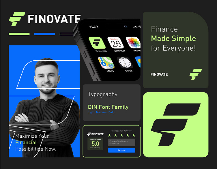
The logo branding design for Finovate is a modern and professional representation of a finance-focused brand. Here’s a breakdown of the elements and their significance:
Logo and Symbolism
The logo features a bold and dynamic “F” symbol that conveys movement and progress. The geometric shapes and clean lines give it a contemporary look, aligning with Finovate's mission to make finance modern and accessible.
The vibrant neon green paired with black and white creates a high-contrast and energetic palette, signaling innovation, growth, and trustworthiness.
Typography
The use of the DIN Font Family (Light, Medium, Bold) ensures clarity and legibility. This sans-serif typeface is highly versatile and works well for both digital and print mediums, reinforcing the brand's professional and approachable identity.
Tagline and Messaging
The tagline, “Finance Made Simple for Everyone!”, encapsulates the brand's goal of inclusivity and simplicity in financial management. It appeals to a broad audience by focusing on accessibility.
Brand Application
Promotional Banner:
The image of a confident professional paired with text like “Maximize Your Financial Possibilities Now” reinforces empowerment and trust.
The blue background offers a calming effect, complementing the boldness of the green highlights.
Mobile Icon:
A sleek and minimal app icon design integrates the logo for easy recognition on mobile devices.
User Feedback:
Including a 5-star rating and user review section in the branding adds credibility and encourages engagement.
Collateral Consistency:
Consistent use of colors, fonts, and design elements ensures a unified brand identity across various platforms and mediums.
Design Impact
This branding design effectively combines aesthetics and functionality, positioning Finovate as a forward-thinking financial service provider. The cohesive and vibrant visuals communicate trust, innovation, and simplicity, making it appealing to tech-savvy and finance-conscious audiences.


