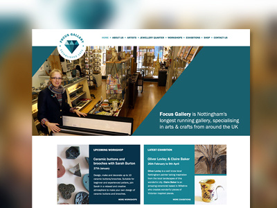
Focus Gallery Homepage
It's been fun working with Antonia from Focus Gallery to work with and develop the branding I did last year onto the web.
Toni's direction was to continue to keep everything bold yet clean and sharp so we kept the homepage fairly simple with a clear space for an introduction and links to the upcoming workshops and exhibitions. Instead of promoting products on the homepage, we decided to create an Artist of the Month section allowing Toni to promote an artist in the shop and on social media.
I've spent the last week theming the website and I have to say it's been a real challenge. Flexbox saved my bacon with the two equal height boxes.
More by Katherine Cory View profile
Like

