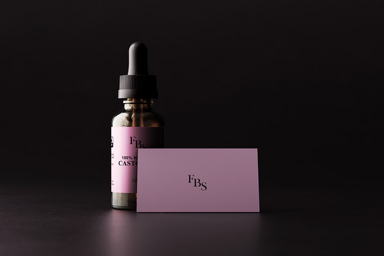
Castor Oil Packaging Design | FBS Naturals
Introduction:
FBS Naturals' Castor Oil is a premium, 100% natural product, inspired by the purity and vibrancy of the Australian environment.
This packaging design project aims to create an elegant, minimal, and modern aesthetic that aligns with the brand's values of quality, simplicity, and sustainability.
Design Concept:
Color Palette:
A soft pink base, symbolizing purity and femininity, paired with a sleek black for contrast and sophistication.
Hints of earthy tones to connect the product to its natural roots.
Typography:
Clean, serif typography for the brand name “FBS,” exuding professionalism.
Sans-serif fonts for additional details, ensuring legibility and modernity.
Visual Elements:
Minimalistic approach with a focus on the brand name and essential product details.
Aesthetic use of mockups (dropper bottle, folded packaging, and product close-ups) to present the product's practical application and premium nature.
Target Audience:
This design caters to eco-conscious individuals seeking premium and organic beauty products, primarily in Australia and the global market.
The final design encapsulates the essence of FBS Naturals' Castor Oil: pure, professional, and luxurious. The soft pink theme and minimalist approach aim to captivate the target audience, leaving a lasting impression while adhering to the brand's values of quality and sustainability.
Thank You!


