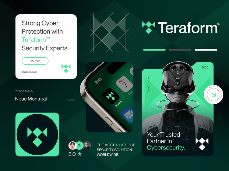
Teraform™ - Logo & Branding Design for IT cybersecurity Company
Revamping Teraform™’s Branding
Challenge:
Teraform™, a cybersecurity company, wanted a modern and trustworthy identity to stand out in their industry.
Logo Concept:
Letter "T" to represent their name.
Shield to symbolize security.
Pixels to highlight their digital focus.
Color Palette:
Green for trust and growth, paired with black and white for a sleek, professional vibe.
Design Process:
Understanding their goals and researching the industry.
Sketching and refining concepts into a clean, modern logo.
Extending the design into cohesive branding assets.
Results:
Enhanced professional image.
Increased client inquiries and positive feedback.
A thrilled client who felt the design perfectly captured their vision.
It was rewarding to help Teraform™ tell their story in a way that resonates with their audience.
Press "L" to show your love ❤️️
______________________________________________________________________________________________
👉 Say goodbye to ineffective logos and hello to a design that’s both memorable and recognizable!🌟
📩 Available for new projects :
Email: info@rahidrehman.me
WhatsApp: https://wa.me/+8801705553455
Telegram: @rahiddesigner
💡 Follow for more update: Dribbble, Behance, Instagram, Twitter, Linkedin
© Rahid Rehman
