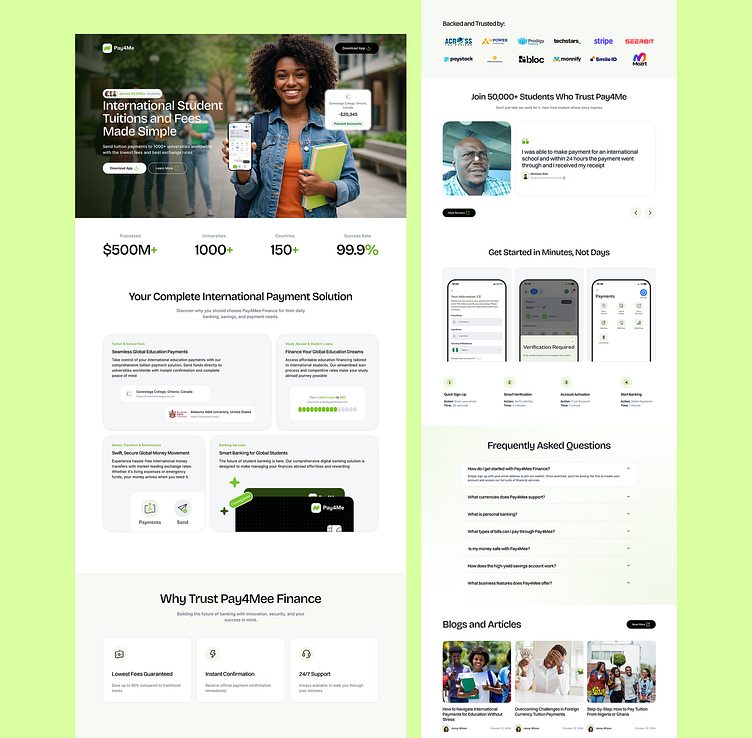
Landing Page Redesign - Pay4me.app
Here's a breakdown of how I reimagined certain sections.
Hero Section
First impressions are everything. I introduced a vibrant image of a happy user/student holding a phone, instantly humanizing the brand and giving it a feel that connects to the target audience. Also adding a kicker of how many students the brand has served.
Statistics Section
Numbers speak louder than words. I added a compelling statistics section highlighting the number of processed payments, partnered schools, available countries and the success rate. These metrics build instant credibility and reassure users that they choose a reliable platform.
Features/Services Section
Clarity is key. I revamped this section with clear visuals and concise descriptions of the brands' services. Users can quickly grasp the benefits without getting bogged down by information, making the platform’s value immediately apparent.
WHy Choose Us Section
This section offers compelling reasons for users to select us over our competitors, building trust and highlighting the brands unique strengths
How it works
I introduced a step-by-step guide that shows users how easy it is to get started. From signing up to making their first payment, each step is visually represented with screenshots and brief explanations. This approach reduces friction and encourages users to take immediate action


