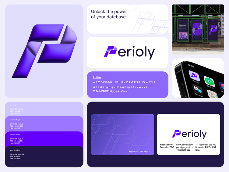
Perioly Branding
Hey Dribbble fam! 👋
Today, I’m thrilled to share one of my most exciting branding projects—Perioly.
Perioly is revolutionizing the way businesses manage their databases. This next-generation CRM is designed to help organizations access essential information faster, reduce wasted time, and increase productivity like never before.
The logo, I was inspired by simplicity and movement, aiming to reflect the flow and precision required in database management. Its geometric design communicates professionalism and efficiency, while the carefully curated colors—lavender, electric purple, and deep blue—symbolize creativity, innovation, and trust.
When designing the logo, is more than just a CRM. For me, it’s about transforming how companies work, simplifying complex processes, and building stronger connections within teams.
This project wasn’t just about creating a brand—it was about helping businesses reach new heights of efficiency and productivity. Perioly embodies modernity, trust, and a commitment to delivering excellence. I’m incredibly proud to have been part of bringing this powerful tool to life, and I can’t wait to see the impact it will have!
Let's work together! ✉️
