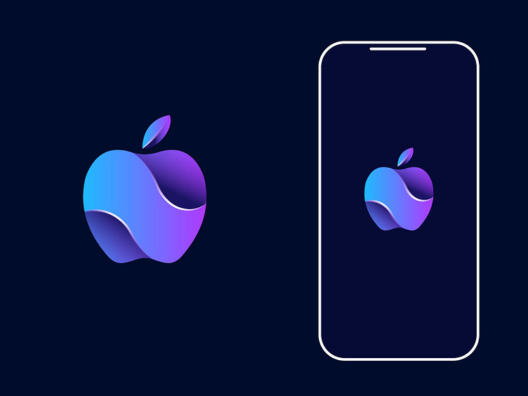
Apple Modern Logo Concept
The Symbolism Behind the Gradient Apple Logo
A Design Journey of Innovation
Introduction: Logos are more than visual elements; they are a narrative, a connection to the brand's identity. This gradient apple logo stands out with its harmonious color transitions and fluid curves, symbolizing innovation and creativity. In this article, we’ll explore the creative process behind this design, the symbolism of the apple icon, and why gradient logos have become a modern trend in brand storytelling.
1. Concept and Inspiration:
The apple has long been a symbol of knowledge, curiosity, and growth. The wavy, flowing elements in the design evoke a sense of fluidity, representing adaptability and forward motion. The gradient choice—from cool blues to vivid purples—reflects a blend of calmness and energy, making the design feel fresh, modern, and approachable.
2. Significance of Gradient Colors:
Gradient colors are trending in logo design for several reasons:
Visual Appeal: The shift from blue to purple captures attention and adds depth.
Symbolic Representation: Blue often symbolizes trust, while purple evokes creativity.
Digital-First Design: Gradients look stunning on screens, making the logo feel dynamic in both web and mobile formats.
SEO keywords: gradient logo, modern logo design, color psychology in branding.
3. The Wave Element:
The wave-like shape within the apple symbolizes innovation, much like how waves represent disruption and change. This subtle visual cue enhances the storytelling, resonating with brands that prioritize technological advancements and creativity.
SEO keywords: brand identity, fluid design, innovative logo inspiration.
4. Practical Design Considerations:
When designing logos for digital platforms, scalability and versatility are key:
Responsive Design: The logo retains clarity at different sizes, from app icons to website banners.
Device-Friendly: This design looks sharp on mobile screens, desktop, and dark mode themes.
SEO keywords: responsive logo design, mobile-friendly branding, digital branding.
5. Final Thoughts – Merging Creativity with Purpose:
The gradient apple logo merges aesthetic appeal with brand values, making it memorable and effective. It tells a story of evolution, creativity, and trust. When creating logos for digital-first brands, it’s essential to combine symbolism, color psychology, and platform-specific adaptability.
SEO Summary: A visually stunning apple logo with gradients can elevate a brand’s identity, emphasizing innovation and creativity. With fluid wave-like shapes and vibrant color transitions, this design showcases adaptability for modern branding.
