Brand Elements // Equity Period
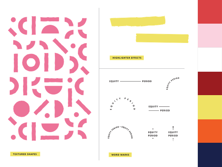
Here's a few of the branding elements that went into the Equity Period brand glow up. I wanted to give them something that felt youthful but also put together and polished. The shape pattern represents the uniqueness of everybody's experience with menstruation and the unique needs that go along with that.
--
Have a project in mind? Let's work together!
More by Rachel Kampen Creative View profile
Like
