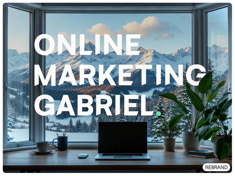
Rebrand for a Marketing All-Rounder
A Bold Identity for a Marketing All-Rounder.
Online Marketing Gabriel needed a visual identity to match Ursula’s bold, hands-on approach and decades of expertise. Our goal was to craft a brand that is as approachable and versatile as Ursula herself, while showcasing her deep commitment to both strategy and execution.
Logo Variations
The logo represents Ursula’s driven, empathetic, and reliable nature, with clean lines and a professional yet approachable design.
Color Palette
This balanced palette reflects Ursula’s dynamic approach to marketing. The grounding dark tone is paired with a fresh, vibrant accent, creating a versatile and modern brand identity.
Typography
The Satoshi typeface family was chosen for its modern geometric sans-serif design, ensuring a professional yet friendly tone. Each weight is used intentionally to highlight Ursula’s strategic clarity and operational precision.
Real-World Applications
The new visual identity works seamlessly across all platforms, from digital to print. The bold typography and vibrant green accent ensure the brand stands out while maintaining professionalism. Each application reflects Ursula’s approachable and dynamic personality, enabling consistent and effective communication with her clients.
Design Process
The design process was an exploration of Ursula’s values and strengths. Initial ideas evolved through collaboration, rejecting both overly corporate or playful ideas to create a confident, professional identity. Each refinement ensured the final brand was visually striking, versatile, and authentic to her mission
Empowering a Brand to Stand Out with Confidence.
Online Marketing Gabriel’s new visual identity encapsulates Ursula’s unique blend of expertise, empathy, and action. This brand now stands as a true reflection of her holistic approach to marketing.
Have a vision for your brand? Let’s turn it into an identity that truly stands out.


