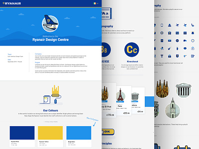
Ryanair Design Centre Case Study
We were tasked with coming up with creating an online style for Ryanair. When we arrived, nearly a year and a half ago, there was very little in terms of a digital style direction.
The previous site was very corporate, basic and was not at all inline with what the main stakeholders expected it to be. Our main aim was to bring some character into it. By introducing illustrations and vibrant colours along with some really clean, intuitive UI, we feel we're moving in the right direction!
See the full case study here:
https://www.behance.net/gallery/34224289/Ryanair-Design-Centre
More by Al Power™ View profile
Like

