Filson Logo Update

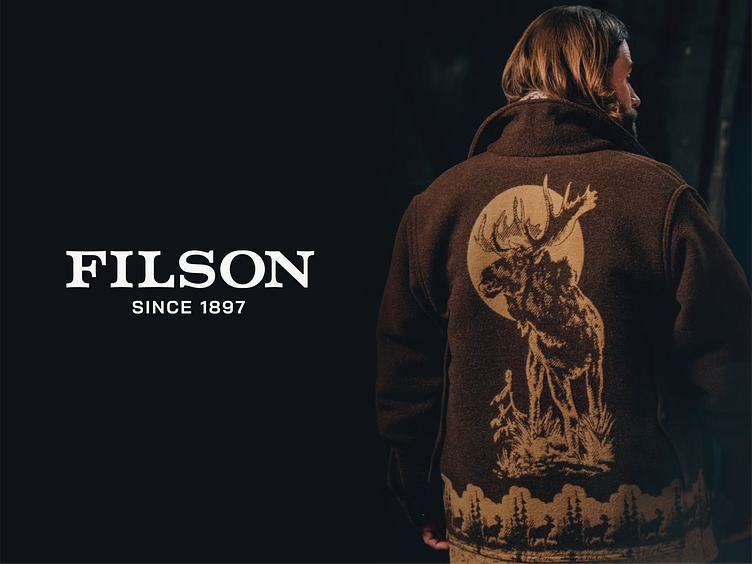
As a year-end creative project, I redesigned the logo of one of my favorite outdoor clothing brands, Filson. Although I greatly appreciate their top-quality products, I felt their logo could use a few modern refinements. My redesign focused on several key elements: adjusting overall kerning, aligning the angles of the “L” leg and “S” tail, and creating a custom typeface that remains steadfast and bold yet preserves the original character traits. I also enlarged “since 1897” and introduced another custom typeface to give the design a more timeless and trustworthy charm. Ultimately, my goal was to retain the familiarity of the original logo while presenting a fresh, contemporary interpretation for 2025.
