Branding | swiss geol
NEW IMAGE FOR GEOLOGICAL EXPERTISE
Swissgeol is an important provider of geological data, a driving force behind innovation and sustainable land use, and a catalyst for collaboration in geoscience in Switzerland.
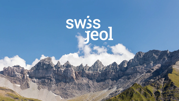
The new logo combines two different fonts that are staggered to represent the variety of rock types found in an outcrop. Different shades of grey show the visual separation between two types of rock, with the darker colour highlighting the geological aspect.
The fonts in the logo are linked but deliberately designed differently: The sans serif font stands for Swiss clarity and simplicity, while the serif font emphasizes the technical expertise and precision of geology.
There is also a hidden, slanted 'i' that represents a borehole. It goes through the layers of rock and interacts with the letters "s" and "g", which are also very important in the design. This element was also integrated into the design of the favicon to ensure a harmonious connection between the main logo and digital applications. The logo combines looking good and doing well, and shows exactly what the client values and what they do.
Thank you!
feel free to follow me on
instagram: montalvo.grafik
behance: Montalvo Lorenzo
pinterest: montalvolorenzo
website: montalvo.ch
