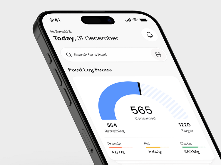
MacroFactor - Revamp Nutrition-Tracking App
𝐇𝐞𝐲 𝐞𝐯𝐞𝐫𝐲𝐨𝐧𝐞!
I recently worked on improving the dashboard design of a nutrition-tracking app, focusing on making it cleaner, easier to use, and more engaging. Here's what I tackled:
A More Personal Touch The header now greets users by name and displays the current date, making the experience feel more personalized and welcoming.
Better Access to Notifications I added a notification icon in the top-right corner, where users naturally expect it. This makes it easier to spot and access without interrupting the flow.
Decluttered Design Removed some redundant buttons that weren’t necessary. The cleaner layout helps users focus on what matters most.
Search Bar Where It Belongs The search bar is now at the top, exactly where users instinctively look for it. This small shift improves usability and flow.
I’m excited about how these changes simplify the experience while keeping it user-focused. What do you think?
I would love to hear your feedback!
Follow us to see more exciting shots and insights on:
Behance | Linkedin | X | Facebook | Instagram
Book a FREE 30 min meeting
We’re available for long-term and short-term partnerships—let’s create something remarkable together!
📩Email us: hello@fixoria.studio


