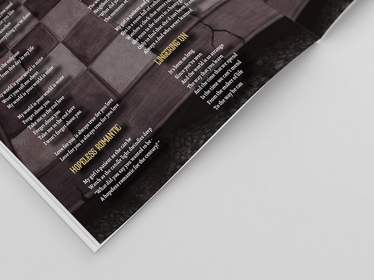
SEPOY DEBUT ALBUM COVER LAYOUT AND CD PACKAGING DESIGN
My client already had the cover art design and a background image for the other pages. They needed type and layout added to their debut cd package. They wanted the layout and type for an 8-page lyric booklet to be inserted into a cd jewel case package and a cd label. The client had very specific ideas and were involved collaboratively in all aspects of the design process from the font choices and sizes and color as well as tracking and kernig elements.
First I changed their images to a print-ready CMYK 300-dpi format in Photoshop. Then, using the printers templates, I laid out the booklet, tray cards and cd label in Adobe InDesign. We went with a white text to match the logo color and changed the opacity of the image to make it more readable over the background image. As per the clients request, we used a victorian display font for the song titles and a typeface intended for literature and long texts for the lyrics that bridged the calligraphy between their logo design and the song title-display font. The headings were done in a yellowish color, inspired from the cover art, to add contrast to the background and white lyrics as well as to tie the pages together. A drop shadow was added to the text to add depth between the text and background image.

