Case Study: Fintech website re-design & development
Project Overview
Introduction
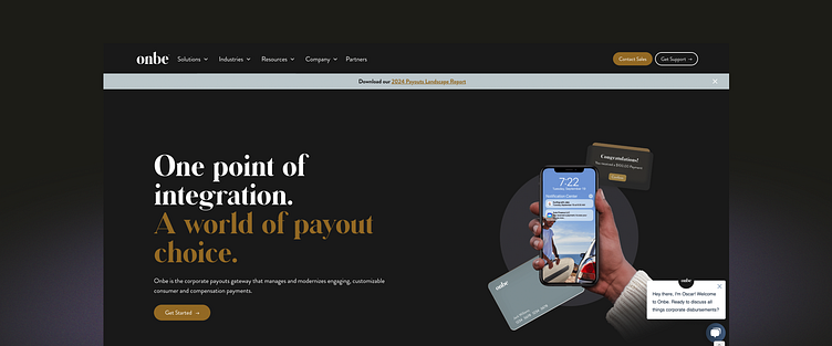
Onbe.com, a financial/payment gateway SaaS, embarked on a mission to redefine its digital presence. The primary goals were to create a user-friendly experience for customers and increase conversion rates. The target audience consisted of C-level organizational leaders specializing in fintech and finance.
Challenges
The existing website of Onbe.com faced significant hurdles:
Confusing User Flow: Users struggled to navigate the site, resulting in a disjointed experience.
Complex Information Architecture: The structure of the site made it challenging for users to find pertinent information swiftly.
Overwhelming Visual Design: The site lacked visual hierarchy and white space, leading to a cluttered and uninviting user interface.
Content Density: The website's content was packed and not easily skimmable, hindering user engagement.
Unclear CTAs: Inconsistent and unclear Call-to-Action buttons contributed to a confusing user journey.
Role and Responsibilities
As the lead in web design and Webflow development, I was entrusted with the entire spectrum of the redesign process, from conceptualization to execution. This involved a hands-on approach in both the creative and technical realms, ensuring a seamless and coherent end-to-end process.
Design Process and Strategy
The redesign process was structured around a user-centric approach, encapsulating the following phases:
Empathy: Understanding the core needs and pain points of the target users through stakeholder interviews.
Define: Setting clear, measurable objectives based on the insights gathered.
Ideate: Brainstorming and conceptualizing design solutions that align with the defined objectives.
Prototype: Developing wireframes and prototypes to visualize the new design and functionalities.
Key Features and Functionalities
Incorporating modern design tools like Figma and Webflow, the redesign introduced:
Simplified Information Architecture: Restructured the content and navigation to offer a more intuitive user journey.
Revamped Visual Design: Implemented a clean, professional design with a well-defined hierarchy and ample white space.
Consistent and Clear CTAs: Redesigned the CTAs to be more engaging and instructive, guiding users effectively through their journey.
User Testing and Feedback
The redesigned website underwent rigorous user testing, providing valuable insights that refined and validated the design decisions. Feedback from real users was instrumental in fine-tuning the user interface and experience.
Outcomes and Results
The redesign of Onbe.com marked a significant transformation, evidenced by:
Quantitative Results: Conversion rates experienced a notable increase, jumping from 1% to 3% post-redesign.
Qualitative Feedback: Users and stakeholders expressed high satisfaction with the new design, noting its ease of use and professional aesthetic.
Reflection and Learnings
Reflecting on the project, the collaboration between design and development proved to be a cornerstone of the project's success. Continuous learning and adaptation to user feedback were pivotal throughout the process, underscoring the importance of a user-centered design approach.
Visuals
While specific visuals such as before and after screenshots, wireframes, and mockups are not provided in this summary, they are integral components of the portfolio, showcasing the transformative journey of Onbe.com's website.
