Github Explore Page Spikings
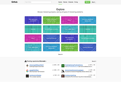

Was playing with a screenshot of the explore page on GitHub because I think it could need some love: https://github.com/explore
It’s not bad or anything but I see room for making this more friendly and effective.
I played with it for an hour. I tried to streamline and simplify a couple of things:
- Deleted the section right below the navbar. Felt redundant, a bit out of place and unnecessary.
- Got rid of the additional “Sign up for free” button. Developers are smart enough to find the “Sign up” button if they decided to sign up. It’s almost an insult to plaster it more than once or worse, all over the place.
- Aligned Sign up / Sign in button with the rest of the main content—was misaligned.
- Placed the GitHub logotype outside the grid to the left to give it more emphasis.
- Nudged the searchbar a bit to the left—left-aligned it with the main content.
- Gave navbar links a bit more room to breath.
- Gave the active navbar link a little green highlight.
- Got rid of randomly bigger project boxes since they conveyed no extra meaning. At first, I thought they might be bigger because of some metric but after a couple of refreshes it was clear that it was just randomized.
- Got rid of card-style project boxes to avoid having yet another design pattern in there—breaking the unity of this section.
- Gave the “See all >” link a bit more spacing.
Overall Result:
I believe this approach could lead to a simpler design that is easier to digest. The project boxes appear less convoluted because of their uniform appearance while giving view to more topics of possible interest.
The navbar does a better job and created more subtle emphasis for the logo while giving the searchbar the top-left alignment it deserves.
I think this could be a nice first step but more design explorations could make this page a lot more awesome—a lot more friendly too. For example, the background patterns could need some love. Not sure they are necessary nor that the randomized patterns do the trick… Also, since GitHub is so famous for creating a super friendly vibe, I see an opportunity to brand this page differently. Another spiking for another time…
FYI:
Taking the screenshot in Safari, I got the “GitHub” logotype. After switching back to Chrome, I got the Octocat silhouette logo instead. Hmm…
