Permata Solution - Brand identity Design
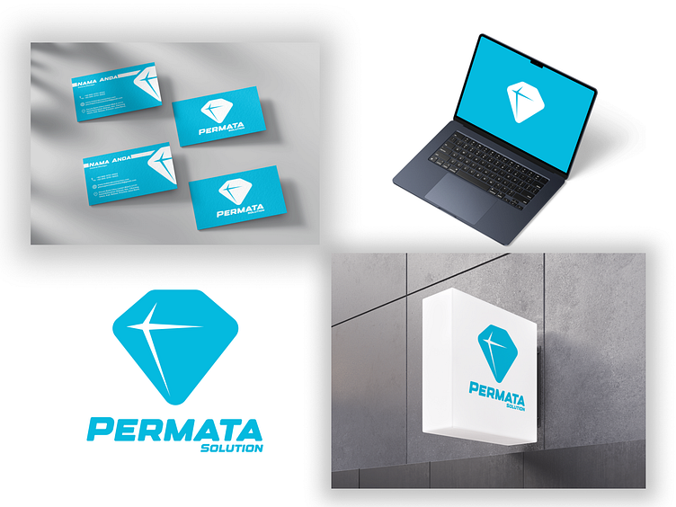
Hello Everyone! 👋 Introducing Permata Solution—a refined and professional brand identity for a company specializing in legal services.
What’s in the design?
✨ A bold logo inspired by the clarity and resilience of a diamond, symbolizing trust and excellence in
legal support.
✨ A vibrant color palette of blues, representing reliability, professionalism, and a modern approach. ✨ Typography that conveys strength and sophistication: Designer Typeface for bold impact and
clean readability.
The Philosophy Behind the Logo
Diamond Symbol:
Represents precision, value, and clarity—essential qualities in the legal industry.
Sharp Lines and Symmetry:
These elements showcase balance and professionalism, reflecting the brand’s commitment to delivering impeccable services.
Blue Tones:
Symbolizing trust, calmness, and professionalism, the colors establish a strong and dependable brand presence.
The Highlights
📌 A cohesive brand identity, featuring mockups of business cards, a website interface, signage, and a
mobile app.
📌 Detailed breakdowns of the logo, including geometry and a thoughtfully curated color palette.
📌 Typography samples that perfectly complement the logo and overall brand aesthetics.
At Lyrative Studio, we bring your brand's essence to life with visual stories that inspire trust and connection.
If this resonates with you, don’t forget to hit ❤️ or “L” to support and share your thoughts in the comments!


