Job Finder App
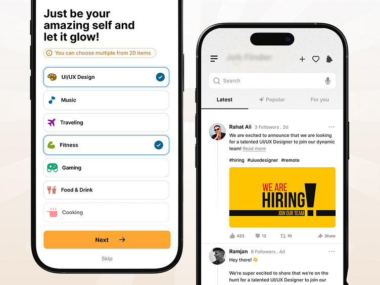
Redesigning the screens to make it more intuitive, visually appealing, and user-friendly.
➽ Key Improvements:
✅ Enhanced accessibility with colorful icons.
✅ Clear, engaging headline to guide users.
✅ Modern grid layout for easy interaction.
✅ Improved call-to-action with "Next" and "Skip" buttons.
I hope you will agree with me ↓
→ The Before Design is minimal but lacks engagement and efficient use of space.
→ The After Design greatly enhances visual appeal, usability, and clarity but might feel slightly overwhelming to minimalist users or lack quick access for specific items.
A simple change can make a huge impact!
Let me know your thoughts!
Follow us to see more exciting shots and insights on:
Behance | Linkedin | X | Facebook | Instagram
Book a FREE 30 min meeting
We’re available for long-term and short-term partnerships—let’s create something remarkable together!
📩Email us: hello@fixoria.studio

