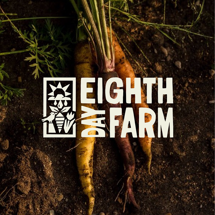
Eighth Day Farm
It was a huge honor to get the chance to reimagine the visual identity of Eighth Day Farm - a non-profit urban farm in Holland MI. I've been a part of their CSA program for the last few years and really feel like my sense of this community has been enriched by the work they do and the food they grow.
Design wise, this was a really interesting/tricky project to embark on because of two things:
1.) It is a beloved organization in the community
2.) It didn't really have a robust brand to build off of or refine.
Creating for an organization that a lot of people have feelings about (myself included) is an interesting experience! I felt conscious of the fact that folks would have real opinions about what we put together. There's a healthy pressure to that. Additionally, when you're building around what was previously a very small, hastily-put-together brand, you're inviting people to notice something they otherwise might not've put any thought towards, which in turn, can garner a disproportionate amount of scrutiny towards the new work.
It's made me think that in a funny way, sometimes an audience can be endeared to a derpy old logo simply because of its familiarity and perceived modesty.
All that said, from the get go, we singled out typography as the key driver of this project. One of the problems Eighth Day was having was that every promotional piece needed to be hand drawn, which to be fair, a staff member of theirs was good at, but, it was taking up more time than they could justify.
Because of that, we started building out a custom typeface anyone could use for all EDF communications.
In addition to the typeface, we put together a small handful of supplementary marks for fun! Time will tell whether or not the farm has the bandwidth to put these sorts of things to work, but for small merchandise items, like tees, totes and stickers, these have served as small extensions of the brand.


