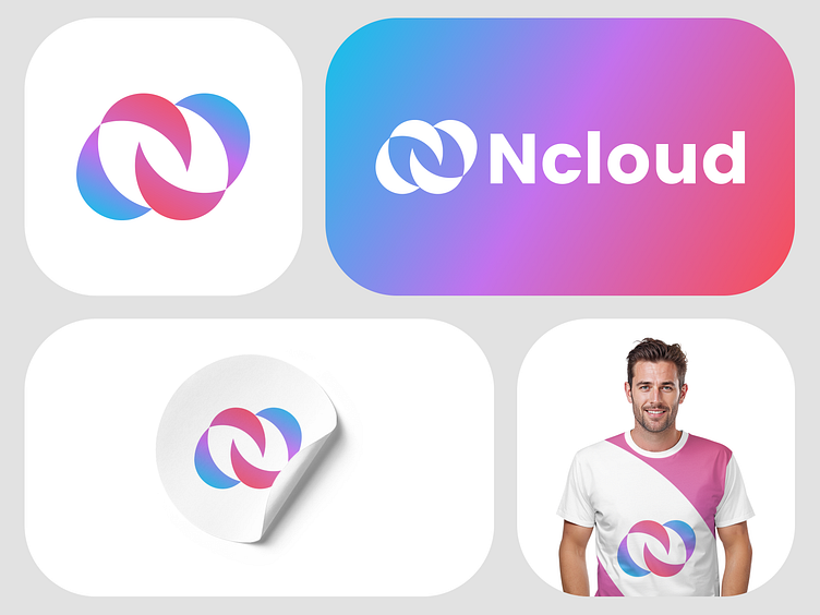
Ncloud, tech compeny logo
Hi everyone! 👋
I’m excited to share this logo concept I created for Ncloud during their branding process. The goal was to reflect the brand’s essence—cloud computing, innovation, and simplicity. The design features a creative blend of a cloud shape, with the negative space forming the letter “N” to represent the brand name and its focus on cloud-based solutions.
I chose a vibrant gradient of pink and blue to convey modernity, energy, and seamless transitions—qualities that align perfectly with Ncloud’s dynamic and innovative nature. This logo was designed with versatility in mind, ensuring it works beautifully across digital platforms and merchandise alike.
What do you think about this design? I’d love to hear your feedback!
🤔 Drop your thoughts in the comments below! ⬇️
If you’d like to connect for inquiries or consultations, feel free to reach out:
📧 Email : helloofahim@gmail.com
☎️ WhatsApp: Click here to initiate a conversation 💬
