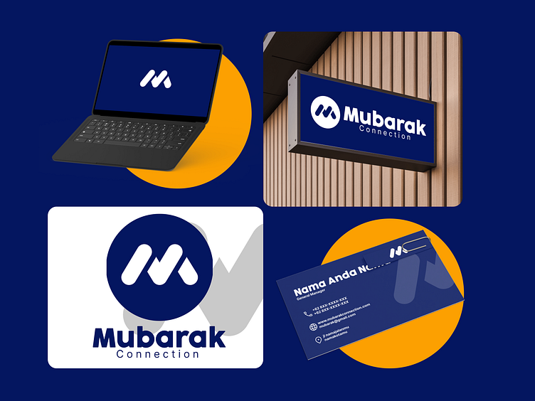
Mubarak Connection - Brand identity Design
Hello Everyone! 👋 We’re thrilled to unveil Mubarak Connection—a bold and timeless brand design concept for a leader in the legal services industry.
What’s in the design?
✨ A strong, versatile logo that embodies professionalism and trust.
✨ A clean, modern color palette tailored for clarity and elegance.
✨ Typography that speaks volumes: Cocogoose for bold statements and Inter for seamless
readability.
The Philosophy Behind the Logo
The Mubarak logo combines simplicity and strength, encapsulated in a dynamic “M” symbol.
Rounded Shapes:
The rounded edges evoke approachability and inclusiveness, reflecting Mubarak’s commitment to client care and accessibility.
Symmetry and Balance:
The geometric balance represents stability and professionalism, essential in the legal services sector.
Deep Blue Circle:
Symbolizing trust and reliability, the blue backdrop enhances the logo’s authoritative presence while maintaining a modern and clean aesthetic.
At Lyrative Studio, we craft visual stories that resonate with your brand’s purpose.
If this vibe resonates with you, hit ❤️ or “L” to support, and let’s connect in the comments!
Thanks for the love and support! Keep an eye out for more creative projects 🚀.


