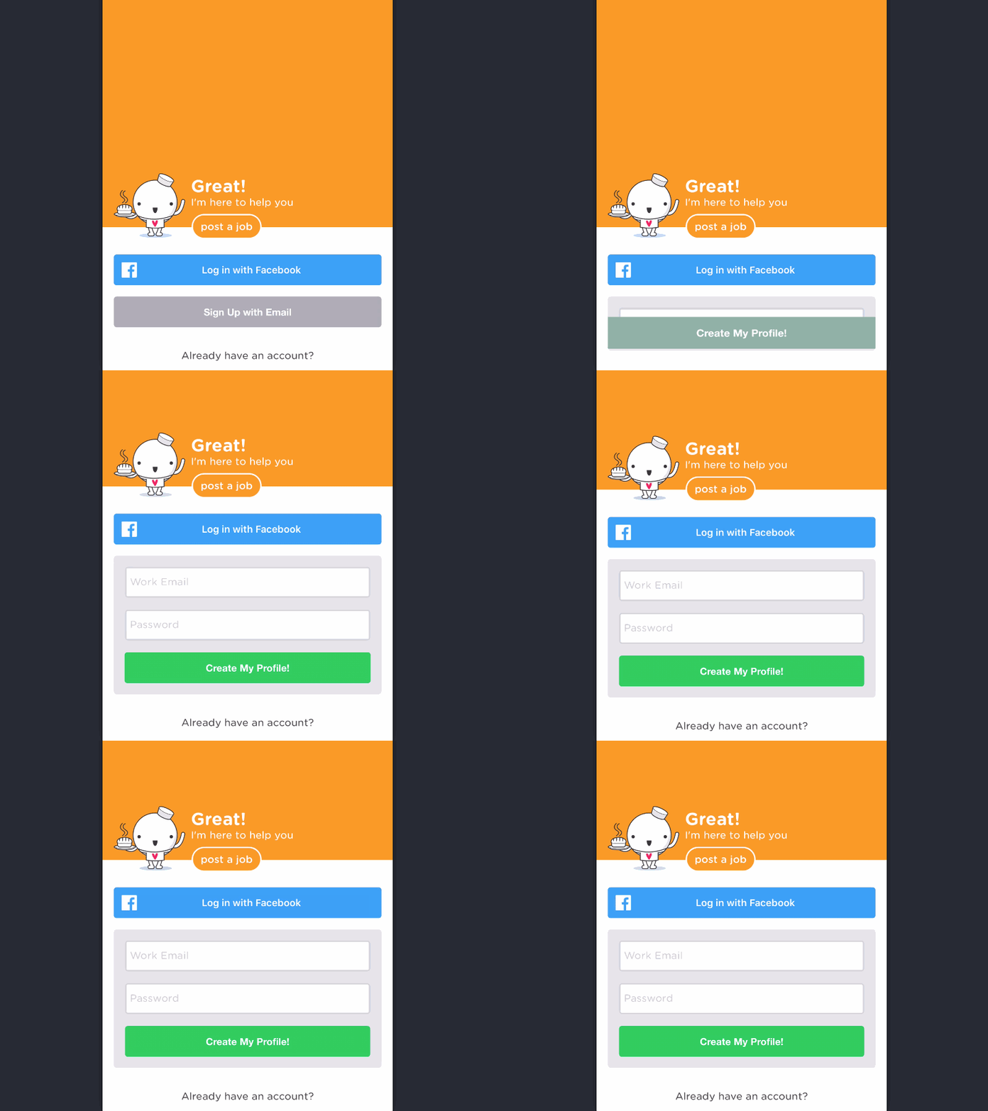
Simple Sign Up Expansion [GIF]
We want people to sign up with Facebook, but know that most of our users will prefer e-mail (the nature of our product). So, we de-emphasize the email signup by making it grey and instead of going to a new screen when they select email sign up, we just expand the form and transition the button so that it doesn't feel like a new step in the process.
This is a working example on iOS animating simple constraints to create.
More by Seth Sandler View profile
Like
